
Visual Object
Visual Object Overview
The Reasoning Flows layer for visualization, reporting, and delivery of data insights.
Purpose
The Visual Object type in Reasoning Flows enables the creation of visual representations, reports, and interactive applications based on processed and transformed data. These objects help teams illustrate trends, patterns, and insights through notebooks, custom applications, and automated delivery systems — turning data into shareable intelligence.
Note: Some objects available under Visual Object also appear under other object types (such as Transform & Prepare or AI & Machine Learning). The distinction is based on intent: when your goal is visualization, reporting, or insight delivery, use Visual Object.
Where It Fits in Reasoning Flows
In the Reasoning Flows architecture:
- Extract & Load brings data into the platform.
- Repository Tables register datasets for reuse.
- Transform & Prepare cleans and structures the data.
- AI & Machine Learning builds and trains predictive models.
- Visual Object displays and communicates outcomes through visualizations, dashboards, or applications.
- Reasoning Atlas documents, contextualizes, and connects these insights within the organization's knowledge framework.
Goal: Visual Objects are the delivery layer of Reasoning Flows — transforming prepared and modeled data into interpretable, shareable insights.
Available Tools
High Performance Computing
Open coding environments for building custom visualizations, dashboards, REST APIs, or interactive applications.
PHP 7.4 Application
Legacy PHP environment for custom backend logic or web applications.
Best for:
- Maintaining existing PHP-based dashboards
- Simple web interfaces
- Legacy system integrations
Note: PHP 7.4 is maintained for compatibility. For new projects, use PHP 8.2.
PHP 8.2 Application
Modern PHP runtime with improved performance, security, and language features.
Best for:
- New web application development
- Custom dashboard backends
- REST API endpoints for visualization tools
Python 3.8 Advanced ML & Plotly
Python environment preconfigured with Plotly for creating interactive data visualizations.
Best for:
- Interactive charts and graphs
- Custom dashboards with Python
- Visual analytics applications
- Combining ML outputs with rich visualizations
Supported visualization libraries:
- Plotly (interactive charts)
- Matplotlib (static charts)
- Seaborn (statistical visualizations)
- Pandas plotting
Example use case:
Build an interactive sales dashboard that allows users to filter by region, time period, and product category with drill-down capabilities.
Notebooks
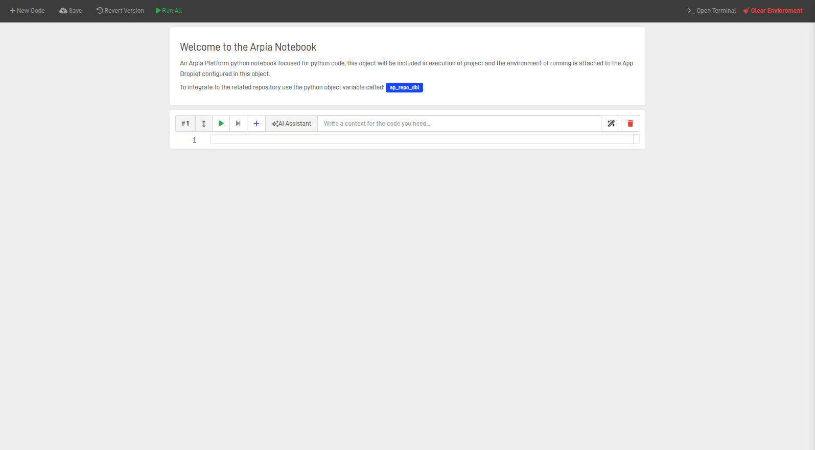
ARPIA Python Notebook
Interactive cell-based coding environment for live data analysis, visualization, and documentation. Users can write, test, and execute Python code directly in the platform while leveraging Reasoning Flows resources and datasets.
Best for:
- Exploratory data analysis with inline visualizations
- Prototyping dashboards before production deployment
- Creating visual reports with narrative documentation
- Testing and validating model outputs visually
- Sharing analysis with stakeholders
Visualization capabilities:
- Inline charts using Matplotlib, Plotly, Seaborn
- Interactive widgets for parameter exploration
- Markdown cells for documentation and context
- Export to HTML for sharing
Example workflow:
import pandas as pd
import plotly.express as px

# Load data from repository
df = repository.read('sales_gold')

# Create interactive visualization
fig = px.line(df, x='date', y='revenue', color='region',
              title='Revenue by Region Over Time')
fig.show()
Notification Engine
AP Notification Engine
GUI-based tool for configuring and sending automated email notifications. Use this to distribute visual reports, summaries, or alerts to stakeholders.
Requirements:
- Mailgun API key (configure in platform settings)
Best for:
- Scheduled report delivery (daily, weekly, monthly)
- Alert notifications when thresholds are exceeded
- Distributing dashboard summaries to stakeholders
- Workflow completion notifications
Example use cases:
- Send a weekly sales summary email every Monday morning
- Alert the finance team when budget variance exceeds 10%
- Notify stakeholders when a new forecast is available
Prepare & Transform Tools
AP Model Render
Executes trained models or transformations and writes structured results into tables. In the visualization context, this prepares final metrics, KPIs, or formatted datasets for display in dashboards and reports.
Best for:
- Preparing aggregated KPIs for dashboards
- Formatting model predictions for visual display
- Creating summary tables for reports
- Generating snapshot data for scheduled visualizations
Example use case:
Run a trained sales prediction model and output a formatted table of forecasted values, ready for display in a dashboard or email report.
Web-Hook Sender
AP Web-Hook Sender
GUI-based tool for sending webhook events or JSON payloads to external systems. Enables real-time integration between Reasoning Flows visualizations and external dashboards or applications.
Best for:
- Triggering external dashboard refreshes
- Sending data to third-party BI tools (Tableau, Power BI, etc.)
- Real-time notifications to Slack, Teams, or other platforms
- Integrating with automation tools (Zapier, Make, etc.)
Example use cases:
- Notify a Slack channel when a new report is generated
- Trigger a Power BI dataset refresh after data updates
- Send processed data to an external analytics platform
Choosing the Right Tool
| If you need to... | Use this tool |
|---|---|
| Build interactive Python visualizations | Python 3.8 Advanced ML & Plotly |
| Explore data and create ad-hoc charts | ARPIA Python Notebook |
| Build a custom web dashboard | PHP 8.2 Application |
| Send scheduled email reports | AP Notification Engine |
| Prepare KPIs for dashboard display | AP Model Render |
| Trigger external dashboard updates | AP Web-Hook Sender |
Typical Workflow Examples
Example 1: Interactive Sales Dashboard
sales_gold (GOLD)
    │
    ▼
Python 3.8 Advanced ML & Plotly
    • Connect to repository
    • Build Plotly dashboard
    • Deploy as web application
    │
    ▼
Interactive Dashboard (accessible via URL)
Example 2: Scheduled Email Report
monthly_summary_gold (GOLD)
    │
    ▼
AP Model Render
    • Format KPIs and metrics
    • Generate summary table
    │
    ▼
AP Notification Engine
    • Design email template
    • Schedule weekly delivery
    │
    ▼
Stakeholder Inboxes
Example 3: Exploratory Analysis with Notebook
raw_data (RAW) + processed_data (CLEAN)
    │
    ▼
ARPIA Python Notebook
    • Explore data patterns
    • Create visualizations
    • Document findings
    • Export to HTML
    │
    ▼
Shareable Analysis Report
Example 4: Real-Time Dashboard Integration
predictions_optimized (OPTIMIZED)
    │
    ▼
AP Web-Hook Sender
    • Send payload to Power BI
    • Trigger dataset refresh
    │
    ▼
External BI Dashboard (updated in real-time)
Best Practices
Choose the right tool for your audience. Use Notebooks for technical analysis and exploration. Use HPC applications for production dashboards that need to be always available.
Prepare data before visualization. Use AP Model Render or Transform & Prepare objects to format data specifically for visual display. Don't build complex data transformations inside visualization code.
Automate report delivery. Use AP Notification Engine for scheduled reports rather than manual distribution. This ensures consistency and timeliness.
Document visualizations in the Knowledge Catalog. Register important dashboards and reports as Nodes so they're discoverable and governed.
Use webhooks for real-time updates. When external dashboards need fresh data, use AP Web-Hook Sender to trigger refreshes rather than relying on polling.
Related Documentation
-
Transform & Prepare
Learn how to structure and format data before visualization. -
AI & Machine Learning
Explore how model outputs can be visualized and delivered through Reasoning Flows. -
Repository Tables
Understand how to access prepared datasets for visualization. -
ARPIA Data Layer Framework
Review which data layers are appropriate for visualization (typically GOLD and OPTIMIZED). -
Reasoning Atlas Overview
See how visual results and KPIs are documented and connected semantically.
Updated 8 months ago