
Custom Screen Example: Customer Feedback Portal
Step-by-Step Guide: Customer Feedback Portal
Description
This step-by-step guide will demonstrate how to create a customer feedback portal where users can submit their feedback, suggestions, and complaints.
Prerequisites
Before we begin the guide, here is some essential knowledge you'll need to better understand the process of developing this application on the custom screen:
Coding Knowledge
To use and take full advantage of the custom screen, it is imperative to have coding knowledge, especially in the following development languages:
- Bootstrap 4.6
- HTML 5
- CSS 5
- JQuery
- JSON
- Javascript
AutoAPI
The AutoAPI is not directly tied to the Custom Screen, but it is the primary tool for connecting ARPIA's data and information with the Custom Screen. AutoAPI allows us to send and receive information for our data objects and nodes.
For this project, we will use an AutoAPI POST request to gather information from the Custom Screen and send it to a table in our repository.
Table
For this project, we are going to use a table. This table will store the information sent from the Feedback form on the custom screen.
Data App
This project example will focus on the custom screen only and not the whole process of creating a Data App and adding the Custom Screen.
Guide
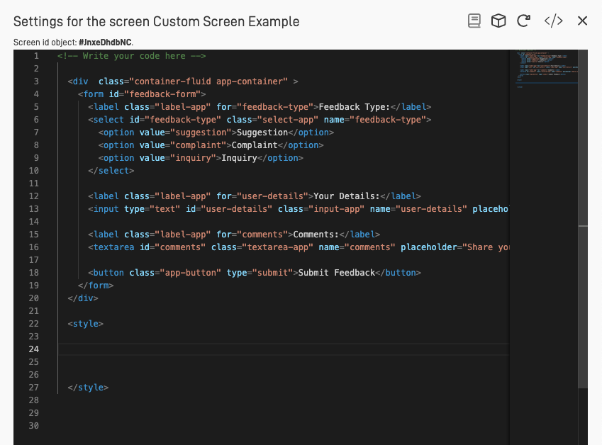
Step 1: Access the Code Editor of the Custom Screen
The first step will be to access the code editor of our Custom Screen. To do this, click on the "Screen" icon on the top right corner of the screen.
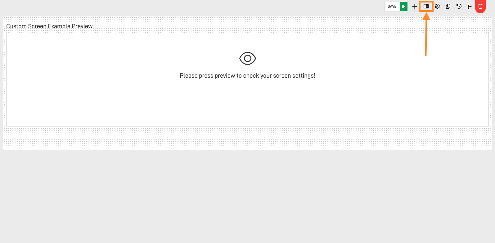
This will open the code editor for the screen on the right side. In this first code editor, we can structure and style the screen using HTML and CSS.
Step 2: Write Your HTML Code
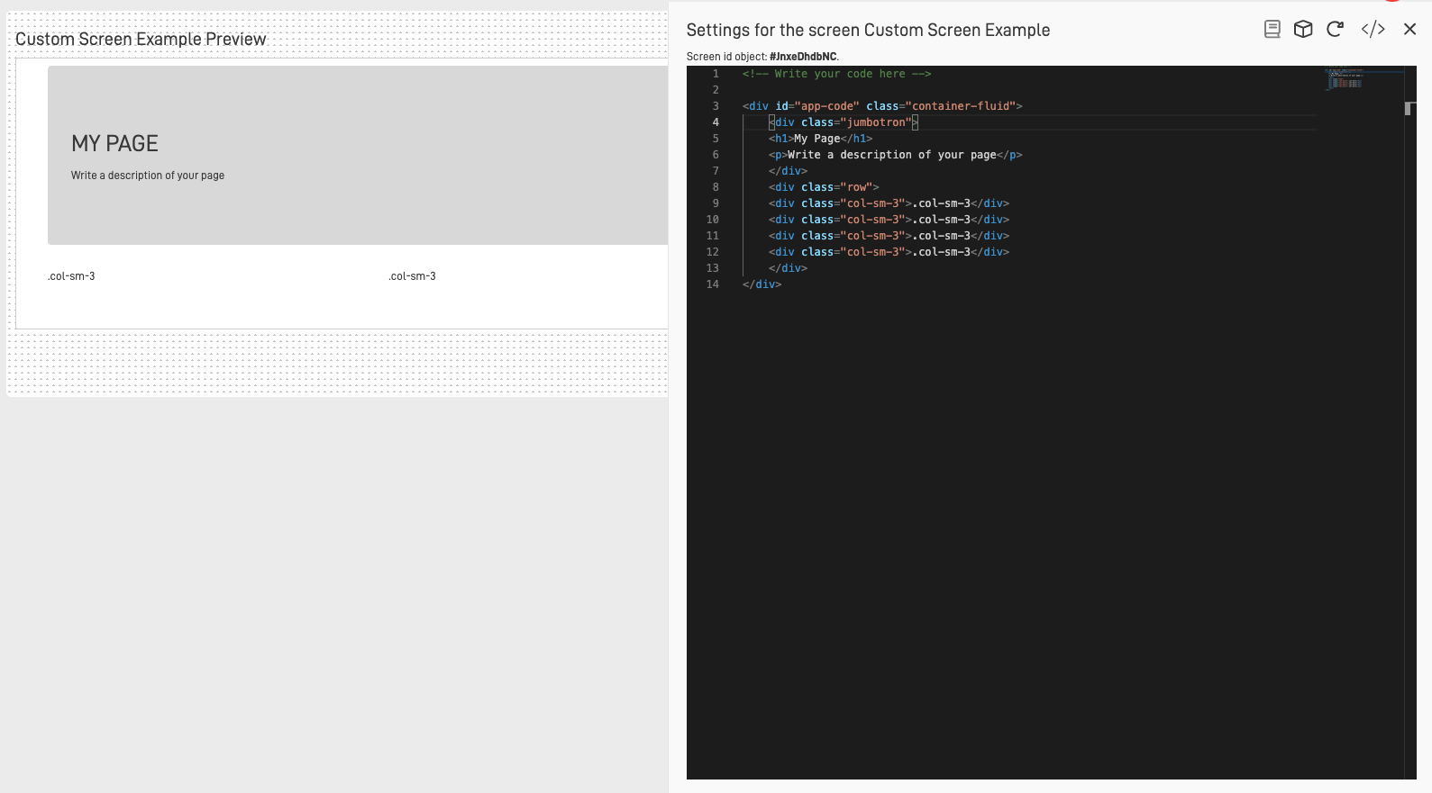
Next, we will erase the example code and start coding our form using a simple structure. It's important to note that writing the <body> and <head> tags is not mandatory, as all the code we write will be embedded within ARPIA's HTML code. Here’s the structure we will use for the project:
<div class="container-fluid app-container">
  <form id="feedback-form">
    <label class="label-app" for="feedback-type">Feedback Type:</label>
    <select id="feedback-type" class="select-app" name="feedback-type">
      <option value="suggestion">Suggestion</option>
      <option value="complaint">Complaint</option>
      <option value="inquiry">Inquiry</option>
    </select>

    <label class="label-app" for="user-details">Your Details:</label>
    <input type="text" id="user-details" class="input-app" name="user-details" placeholder="Enter your name or email" required>

    <label class="label-app" for="comments">Comments:</label>
    <textarea id="comments" class="textarea-app" name="comments" placeholder="Share your feedback here..." required></textarea>

    <button class="app-button" type="submit">Submit Feedback</button>
  </form>
</div>
In the code above, we created a div with the classes "container-fluid" and "app-container". Inside this div, we created a form with the id "feedback-form". This form contains three labeled input areas for user feedback:
- Feedback Type: The label "Feedback Type" asks the user to choose an option. We use a
<select>element with three options: "suggestion", "complaint", and "inquiry". - User Details: The label "Your Details" prompts the user to enter their details. We use an
<input>element of type text to create a text field where the user can write their name or email. - Comments: The label "Comments" invites the user to provide more detailed feedback. We use a
<textarea>element to allow the user to write a full commentary.
Finally, we added a submit button to allow the user to send their feedback.
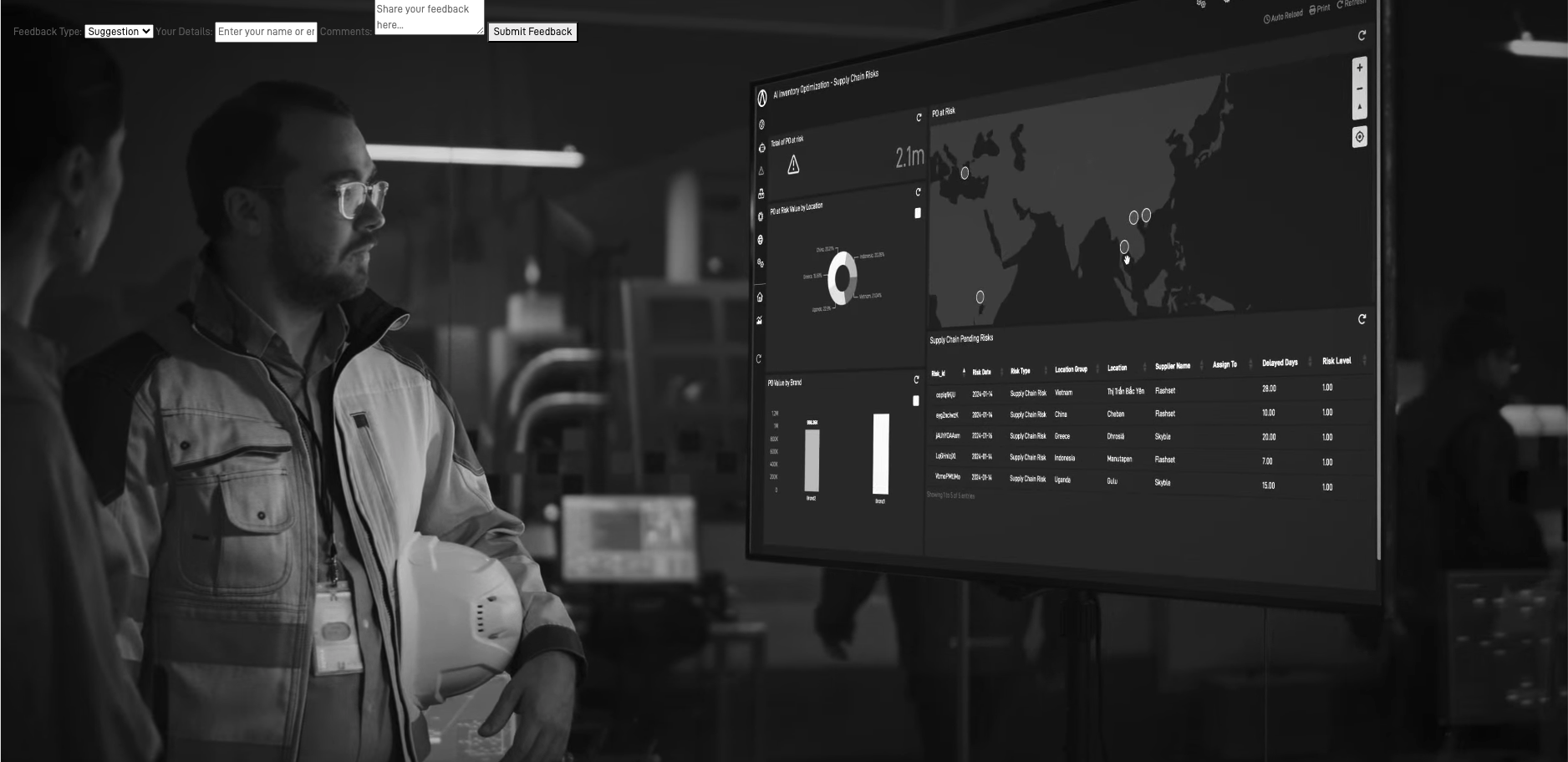
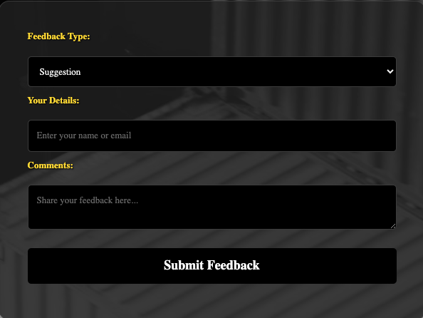
The result of our HTML form:
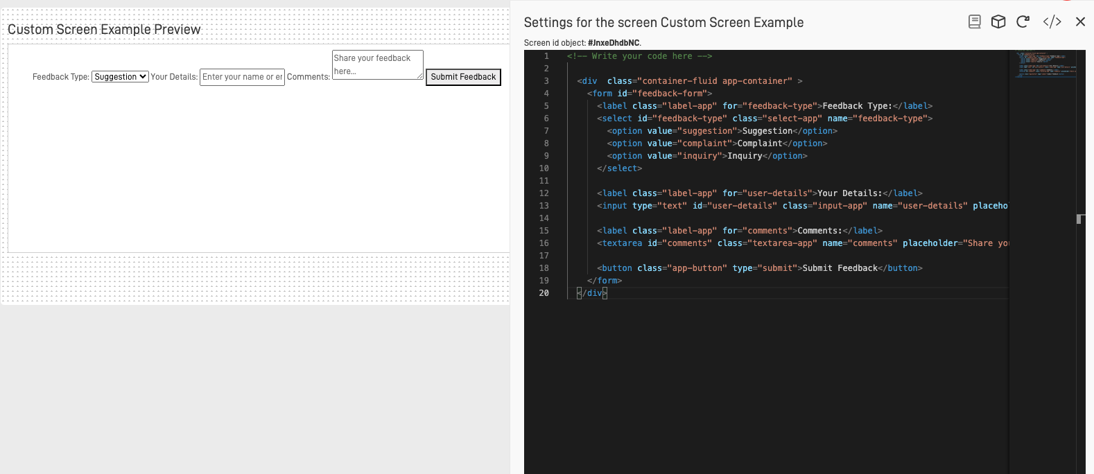
To add more attractiveness to the form, we will include a video as a background. Here’s the code to achieve that (replace video.url with your video URL):
<video id="background-video" autoplay loop muted>
  <source src="video.url" type="video/webm">
</video>
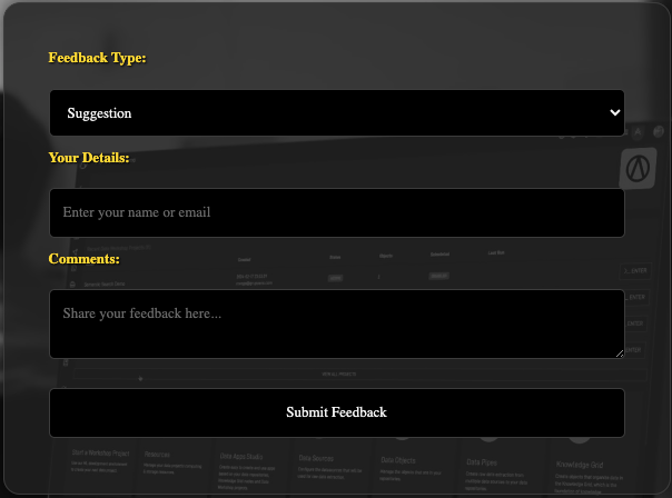
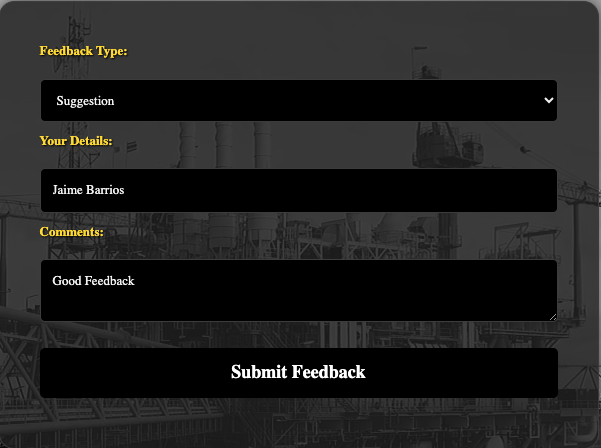
The final result:
Step 3: Use CSS to Style the HTML
We have finished creating our form, but it is very simple and not user-friendly. To resolve this issue, we will use CSS to transform the form into a more attractive, responsive, and user-friendly design.
The first step is to create a <style> tag in our code editor. All of our CSS will be placed inside this tag. Although the <style> tag can be positioned anywhere in the code, it is highly recommended to place it either in the <head> section or in a separate CSS file. This approach makes the code easier to access and helps maintain an organized code structure.
Here’s how you can include the CSS in your HTML:
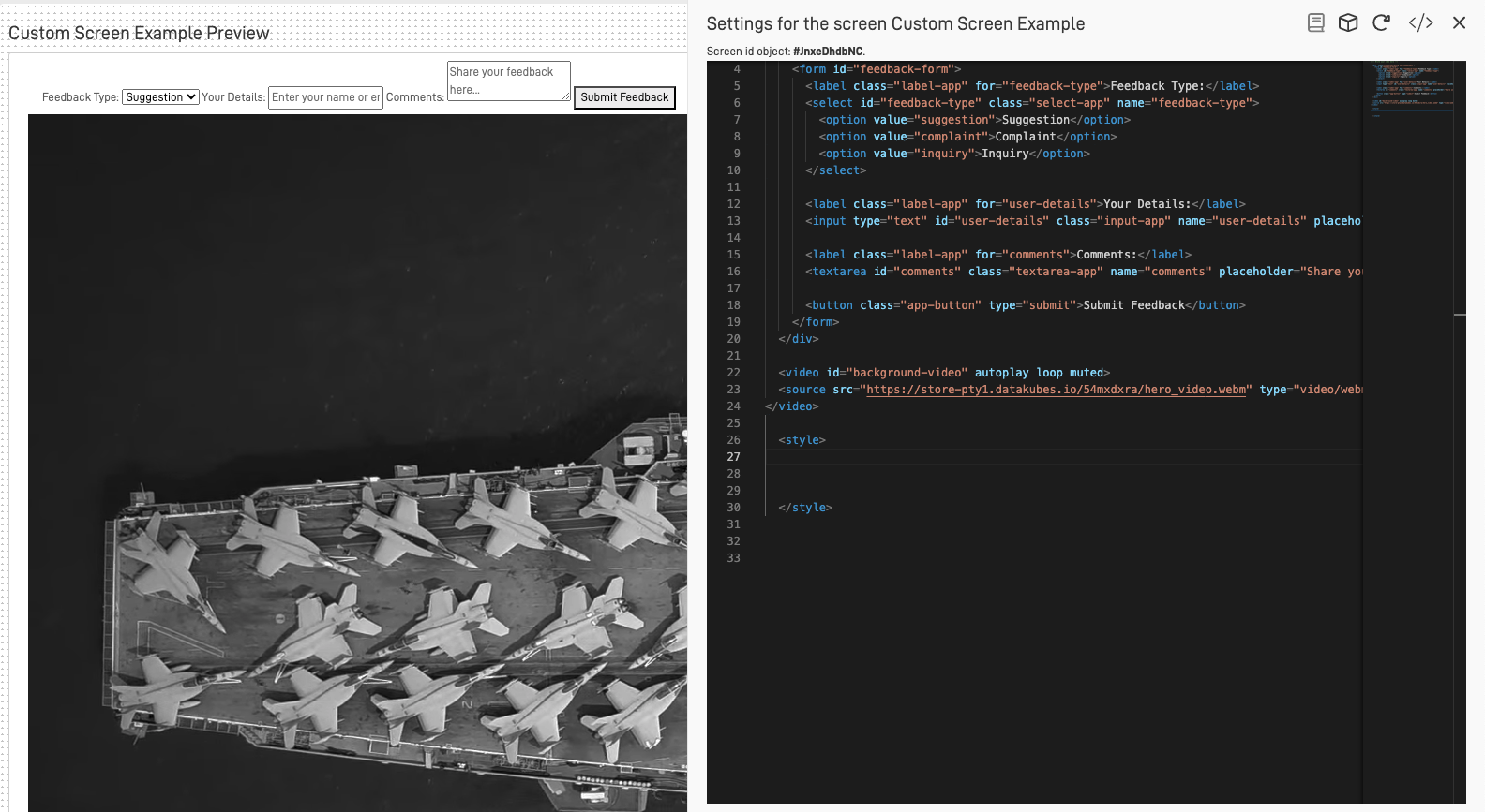
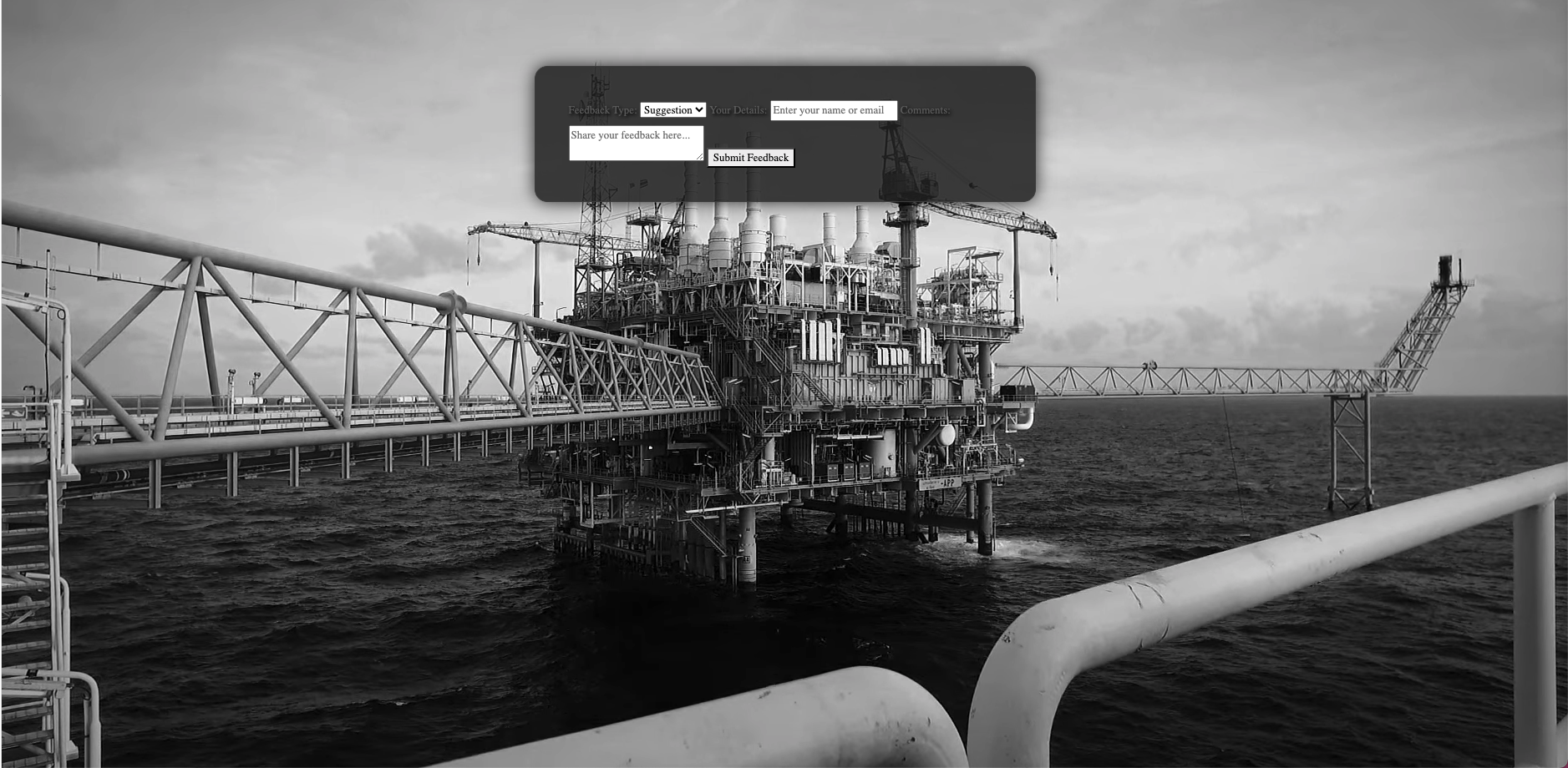
The first element we will modify is the video. Currently, it is positioned below the form instead of serving as the background. We will use its id to make the necessary changes to place the video in the background.
#background-video {
  position: fixed;
  top: 50%;
  left: 50%;
  min-width: 100%;
  min-height: 100%;
  width: auto;
  height: auto;
  z-index: -1;
  transform: translateX(-50%) translateY(-50%);
  background: url('video.url') no-repeat;
  background-size: cover;
}
This would be the result:
Next, we will style the form container. Currently, the form's font color and structure do not effectively help the user understand the questions or locate them on the screen. We will use the app-container class to improve the form's appearance and usability.
.app-container {
  padding: 40px;
  background: rgba(34, 34, 34, 0.85);
  border-radius: 15px;
  border: 1px solid #444;
  box-shadow: 0 0 20px rgba(0, 0, 0, 0.8);
  max-width: 600px;
  margin: 80px auto;
  font-family: 'Garamond', serif;
  text-shadow: 2px 2px 4px #000;
  overflow: hidden;
}
This would be the result:
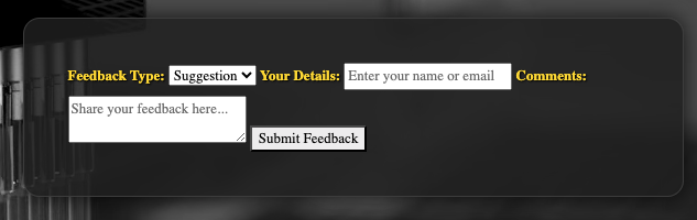
Now, the form is easier for users to find due to the background color we added to highlight it. However, the form is still unstructured and not very user-friendly. To address this, we will begin by standardizing the label structure. We will use the label class to ensure that each label has a consistent appearance and configuration, making the form more organized and easier to understand.
.label-app {
  font-weight: bold;
  color: #ffdd00;
  text-shadow: 1px 1px 2px #000;
}
Now that the questions are easy to identify, we will focus on structuring and styling the user inputs. This includes the select dropdown, text input, textarea, and submit button. By applying consistent styling and structure to these elements, we’ll enhance usability and ensure a cohesive design throughout the form.
.input-app, .textarea-app, .select-app, .app-button {
  width: 100%;
  padding: 12px;
  margin: 10px 0;
  border-radius: 5px;
  border: 1px solid #444;
  background: #000;
  color: #f5f5f5;
  font-family: 'Garamond', serif;
}
These changes organize the form vertically, making it easier to navigate
and clearly associating each input with its corresponding question. To further enhance usability, we can make additional individual changes to the submit button, ensuring it stands out and is easily identifiable for the user.
.app-button {
  background-color: #000;
  color: #fff;
  font-size: 18px;
  font-weight: bold;
  cursor: pointer;
  border: none;
  transition: background-color 0.3s ease;
  text-shadow: 1px 1px 2px #000;
}
For the final touches, we can add some interesting features using this code:
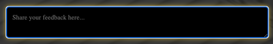
.input-app:focus, .textarea-app:focus, .select-app:focus {
  border-color: #ffdd00;
  box-shadow: 0 0 10px rgba(255, 221, 0, 0.8);
}

.app-button:hover {
  background-color: #ffc400;
}
This will highlight the input fields when clicked, and the submit button will change its background color when hovered over.

Step 4: Add JavaScript to Send the Information
We now have a user-friendly and well-structured form. The next step is to add functionality by using the AutoAPI tool in ARPIA to send the form data to a table in our repository.
First, access the script code editor by clicking on the "angle brackets" icon (or "Code" icon).
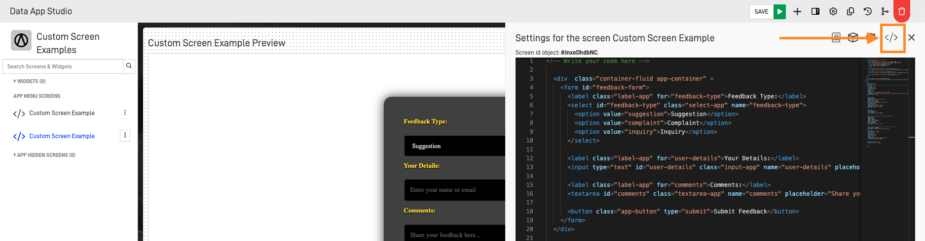
The "Screen Custom Script Editor" will prompt, where we can add all the JavaScript needed to add the required functions of our project.
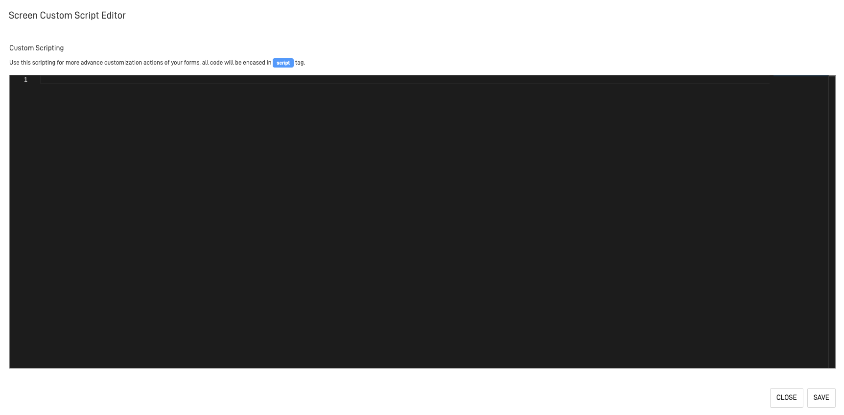
Use the following JavaScript code to set up the submitting function:
$(document).ready(function(){
  $('#feedback-form').submit(function(event){
    event.preventDefault();

    var feedbackType = $('#feedback-type').val();
    var userDetails = $('#user-details').val();
    var comments = $('#comments').val();

    /* POST request */
    var payload = {
      "feedback-type": feedbackType,
      "user-details": userDetails,
      "comments": comments
    };

    $.post("AUTOAPI.URL/?token=AutoApi-token", JSON.stringify(payload), function(response) {
      console.log("Server response:", response);
      document.getElementById("feedback-form").reset();
    }).fail(function(error) {
      console.error("Error in the request:", error);
    });
  });
});
Step 5: Test the Form
Now we are going to test the full functionality of the form. Preview the custom screen and fill the form with information.
Click on the "Submit Feedback" button and check the information on our table.
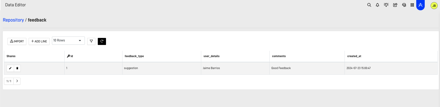
As you can see, the information was sent successfully. Now we have a working form screen.
Conclusion
In conclusion, the custom screen we developed demonstrates a clear and effective approach to creating a user-friendly and functional form. By incorporating styling and layout adjustments, we enhanced the form's visual appeal and usability, making it easier for users to navigate and interact with.
The integration of the AutoAPI tool ensures that the form data is efficiently sent to our repository, providing a seamless experience from data entry to storage. With the functionality now tested and confirmed, the custom screen is well-equipped to handle user feedback effectively.
This serves as a perfect example of why the Custom Screen is such a powerful tool. By leveraging basic knowledge and a few straightforward steps, we created a fully personalized form that seamlessly integrates with our ARPIA Repository.