
How to use the Dropdown of Screens?
Step-by-Step Guide: Dropdown of Screens
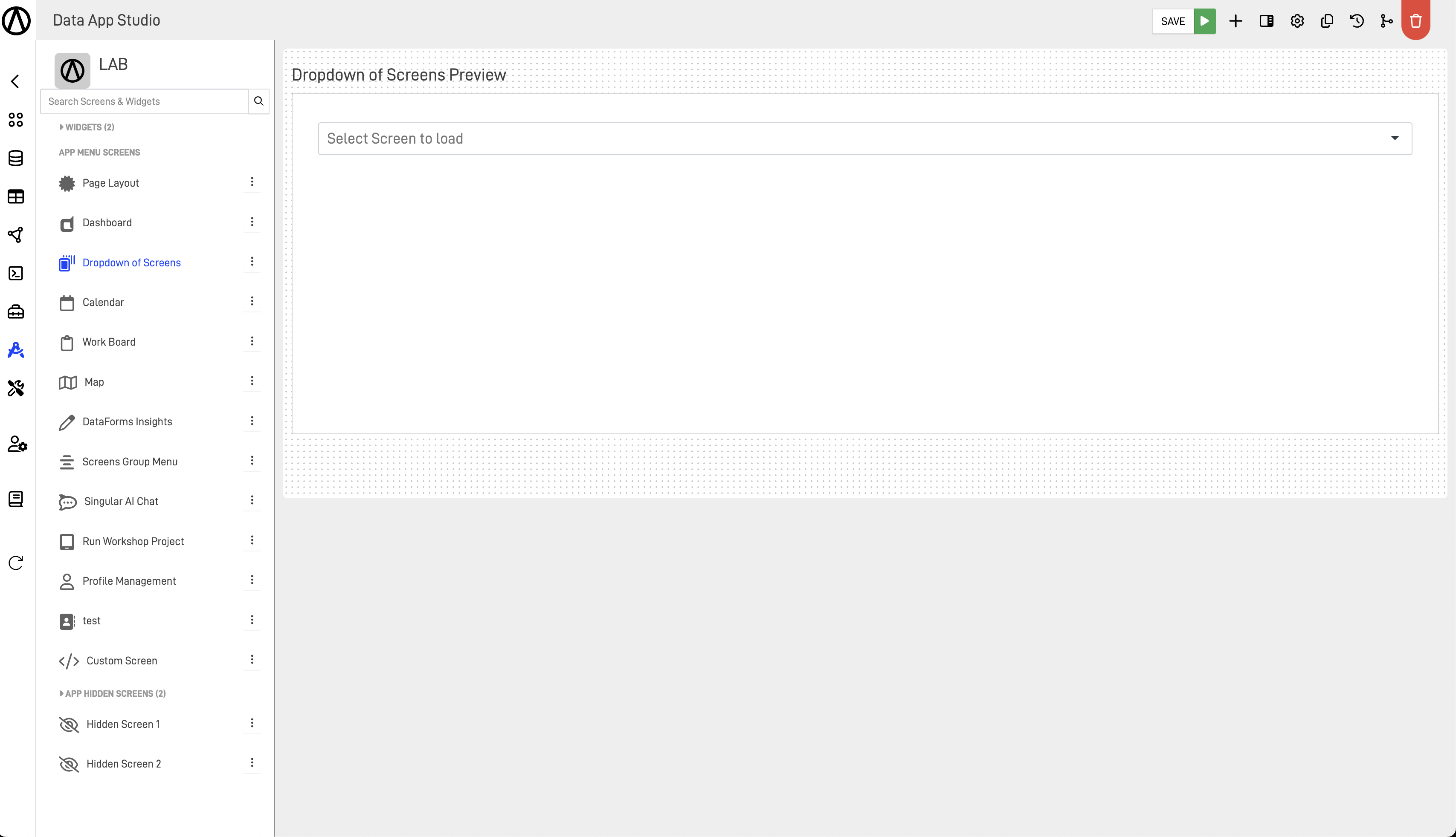
In this step-by-step guide, we will show you how to use the dropdown menus and their main tools to take full advantage of the screen.
Step 1: Configure the "Screen Options"
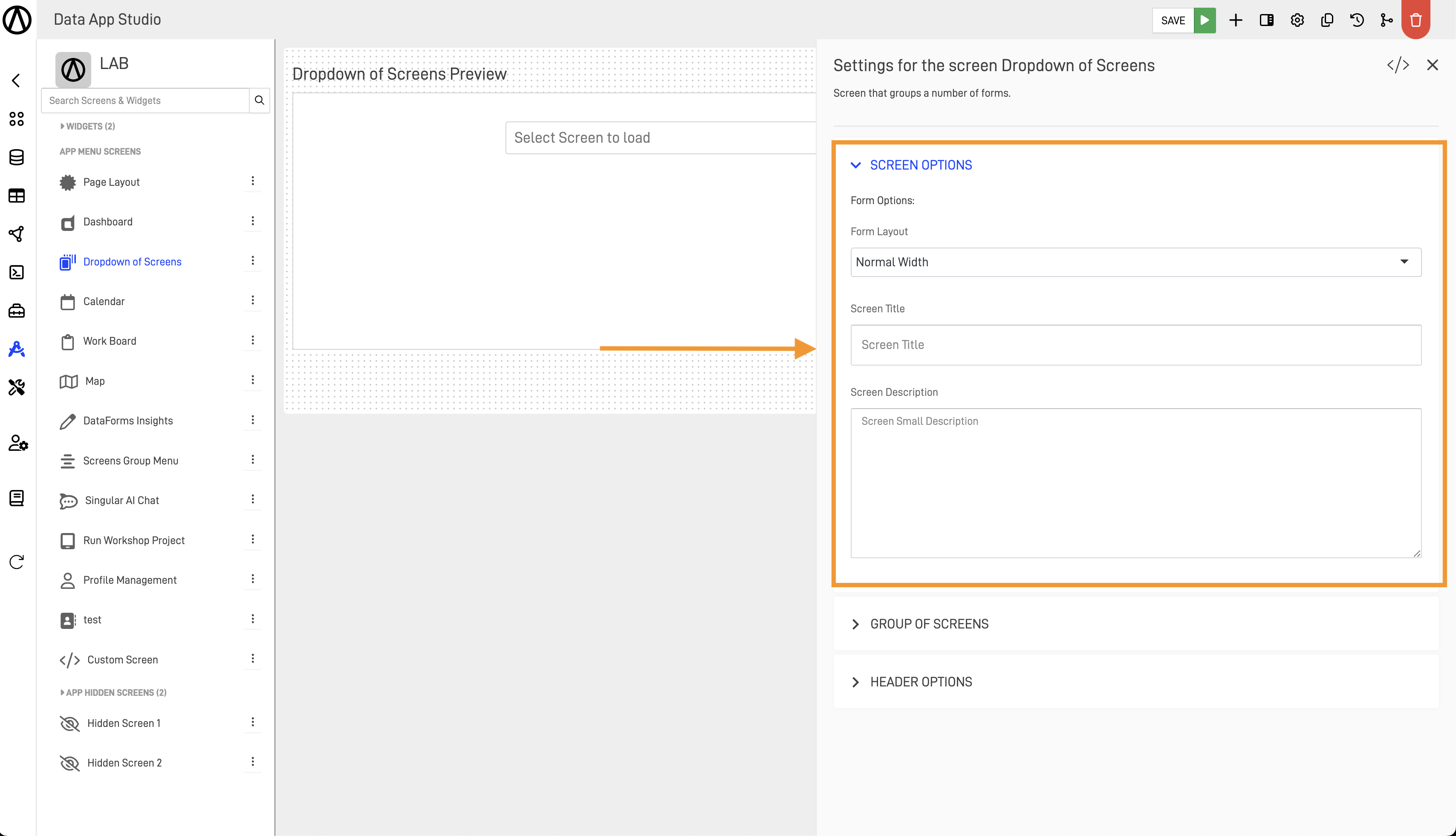
First, we will configure the main settings of the Dropdown of Screens. To do this, access the Settings for the screen Dropdown of Screens menu.
In the Screen options menu, we are met with the form options where we can determine the Form Layout to set the desired width, add a title to the dropdown screen, and also add a description.
Examples of each option:
Full Width:
Normal Width:
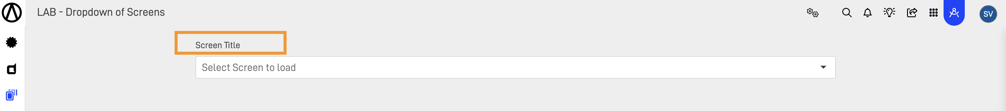
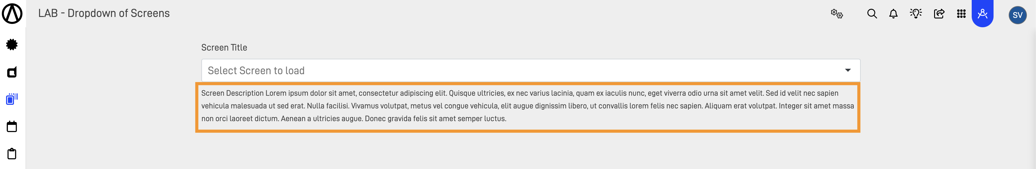
Screen Title and Screen Description (these fields are optional):
Screen Title:
Description Title:
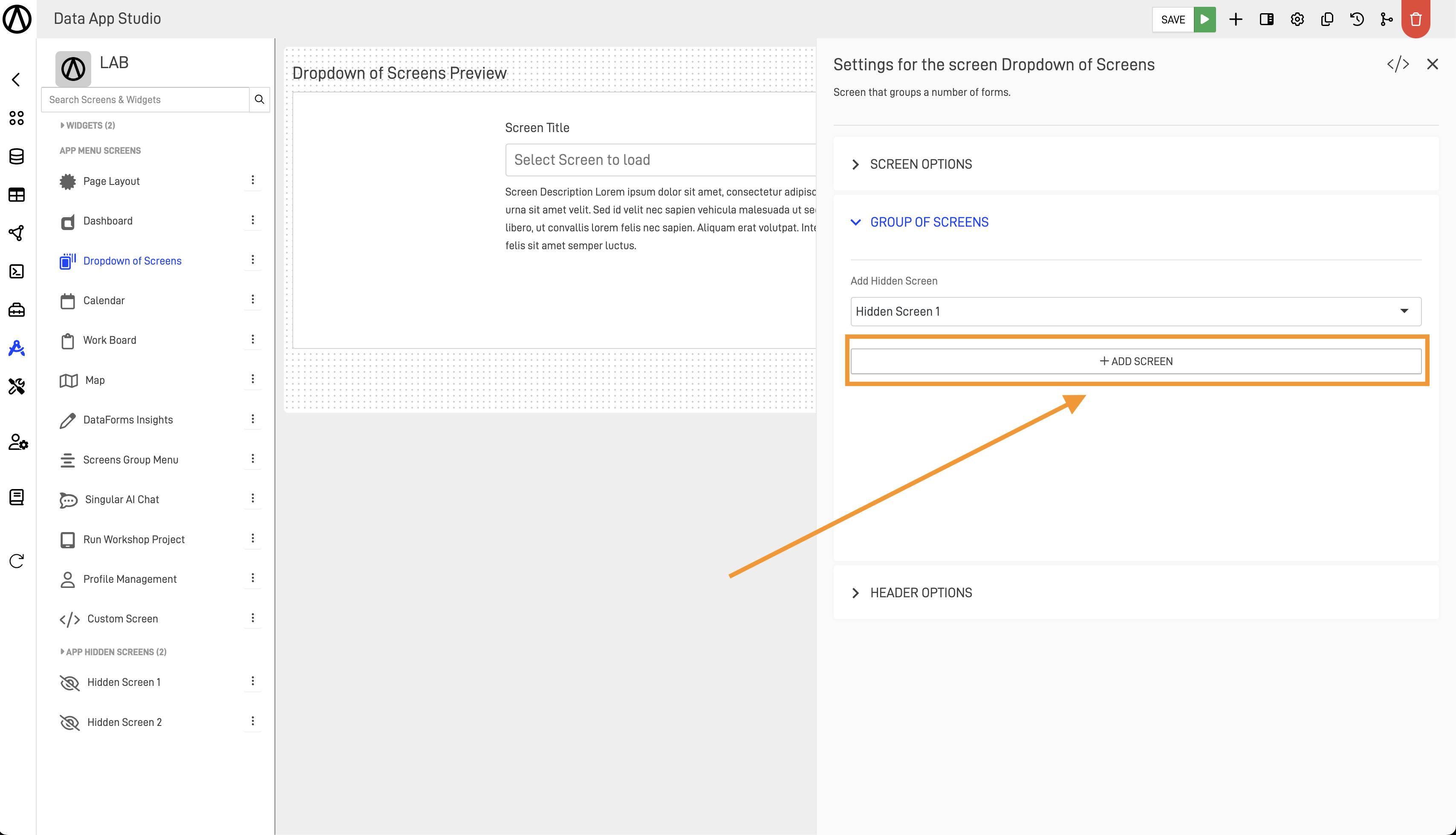
Step 2: Configure the "Group Screens"
Next, we will select which hidden screens will show in the dropdown menu list.
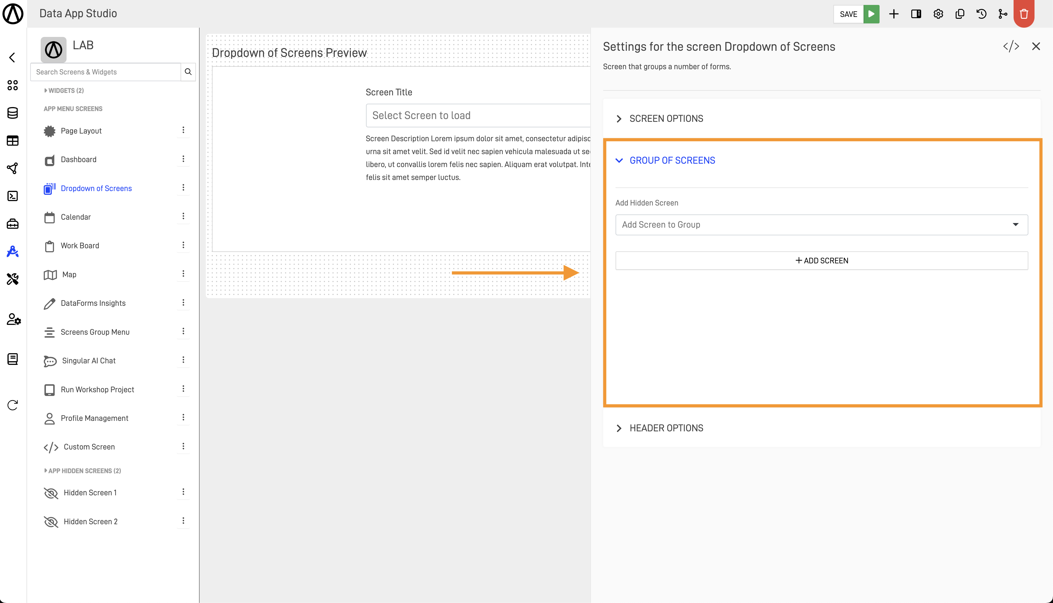
From the Add Hidden Screen dropdown menu, select the screen.
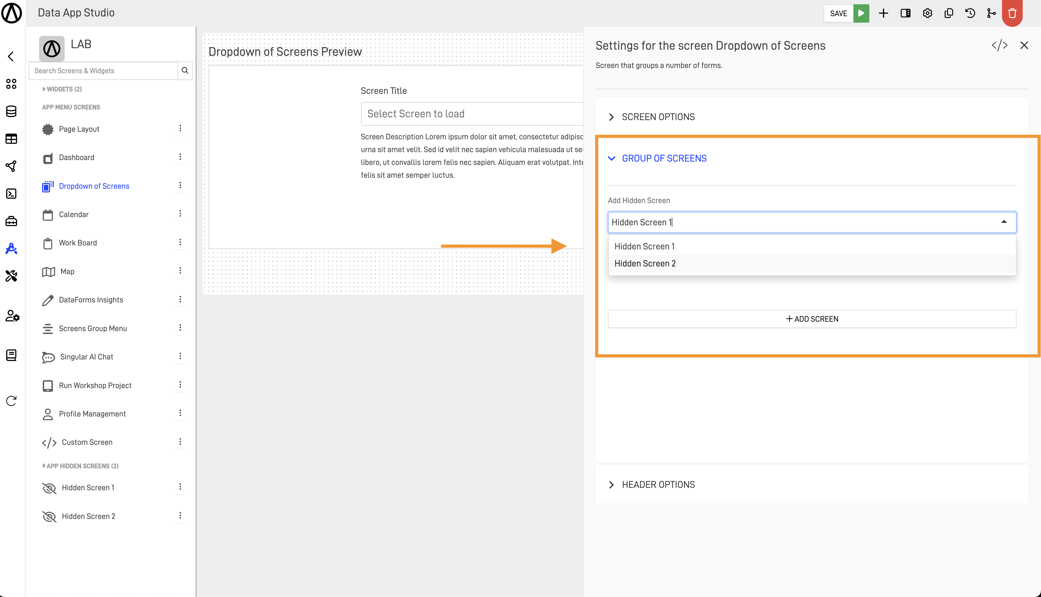
Then press the "+ ADD SCREEN".
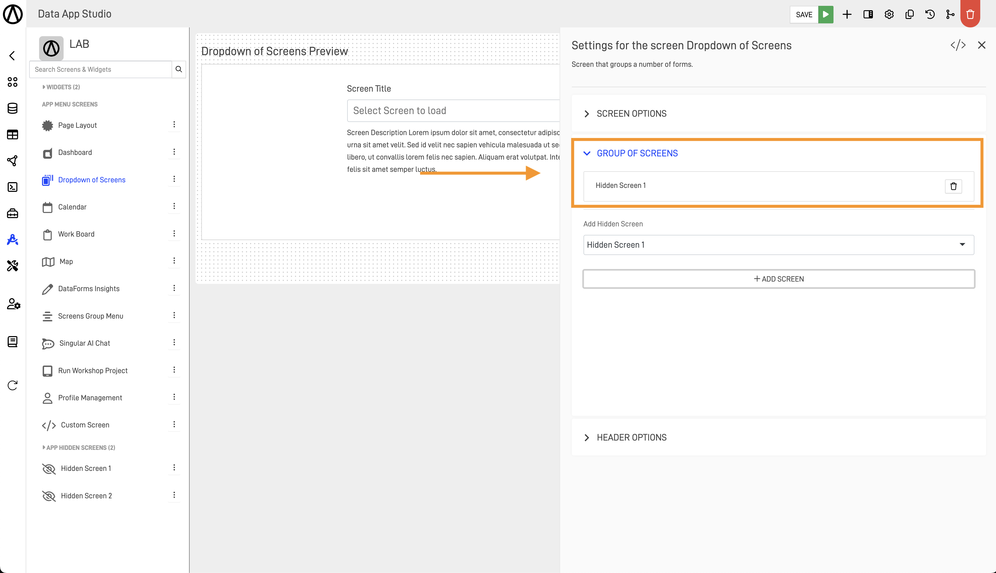
If the screen is added, you will see it above the Add Hidden Screen dropdown menu. To add more screens, repeat the steps.
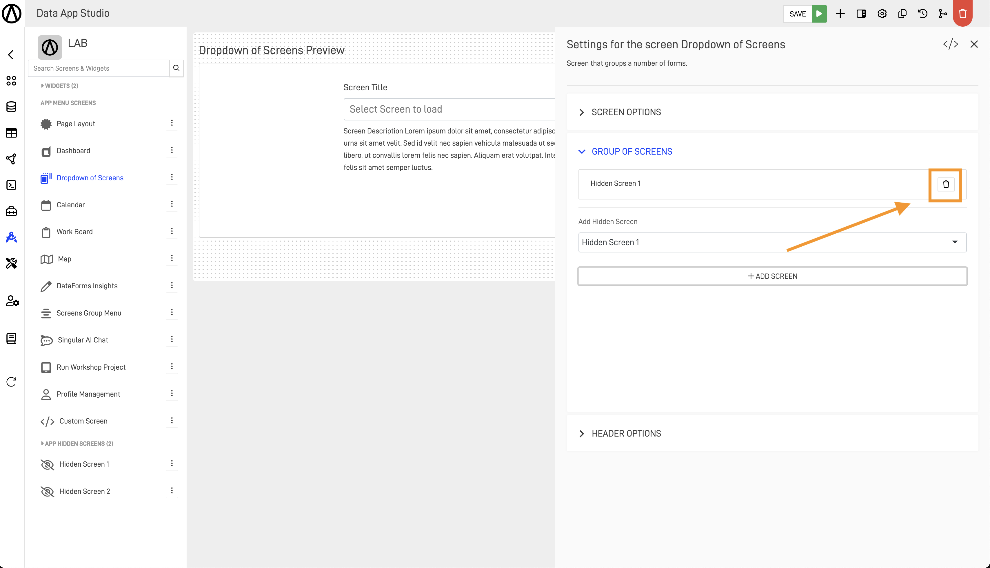
To remove the screen, press the trashcan icon next to the added hidden screen.
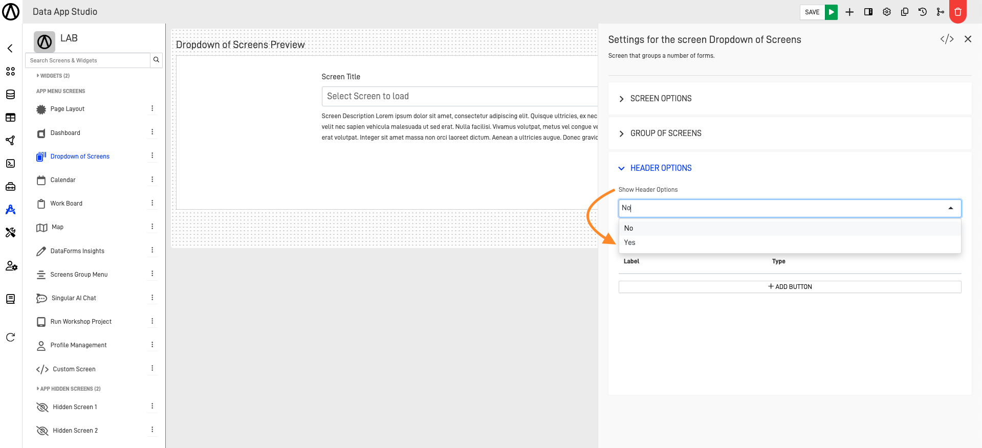
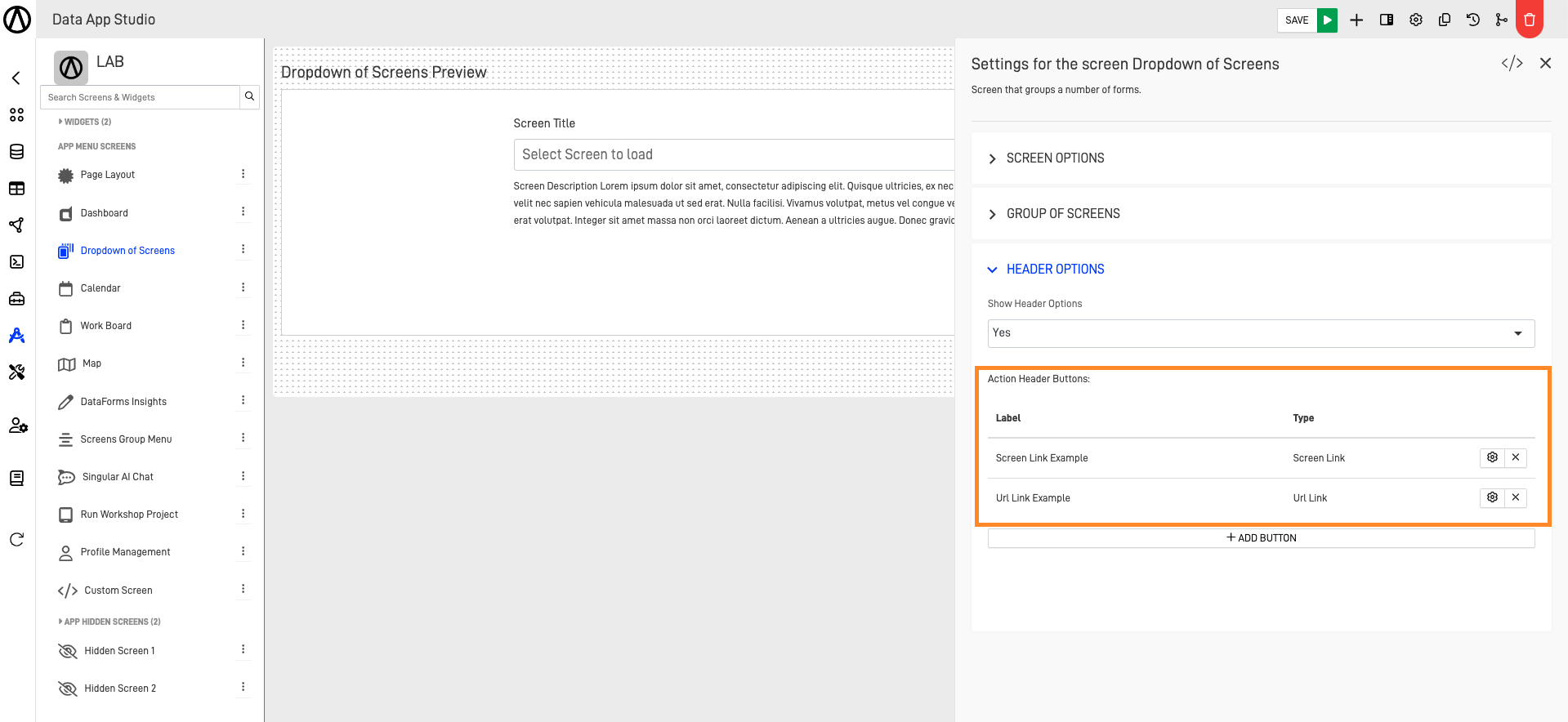
Step 3: Customize the Header Options
We can choose to add a header to our Dropdown of Screens. In this header, we can add action buttons that we can customize to take the user to another screen of our app or link it with a URL to take the user to an external website. The first step is to select the Header Options section.
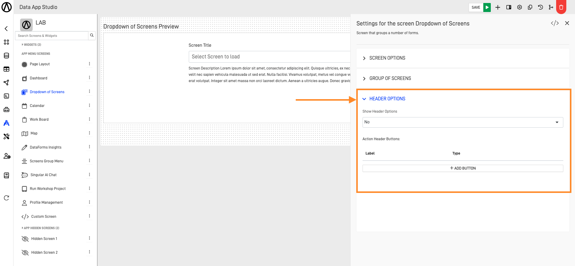
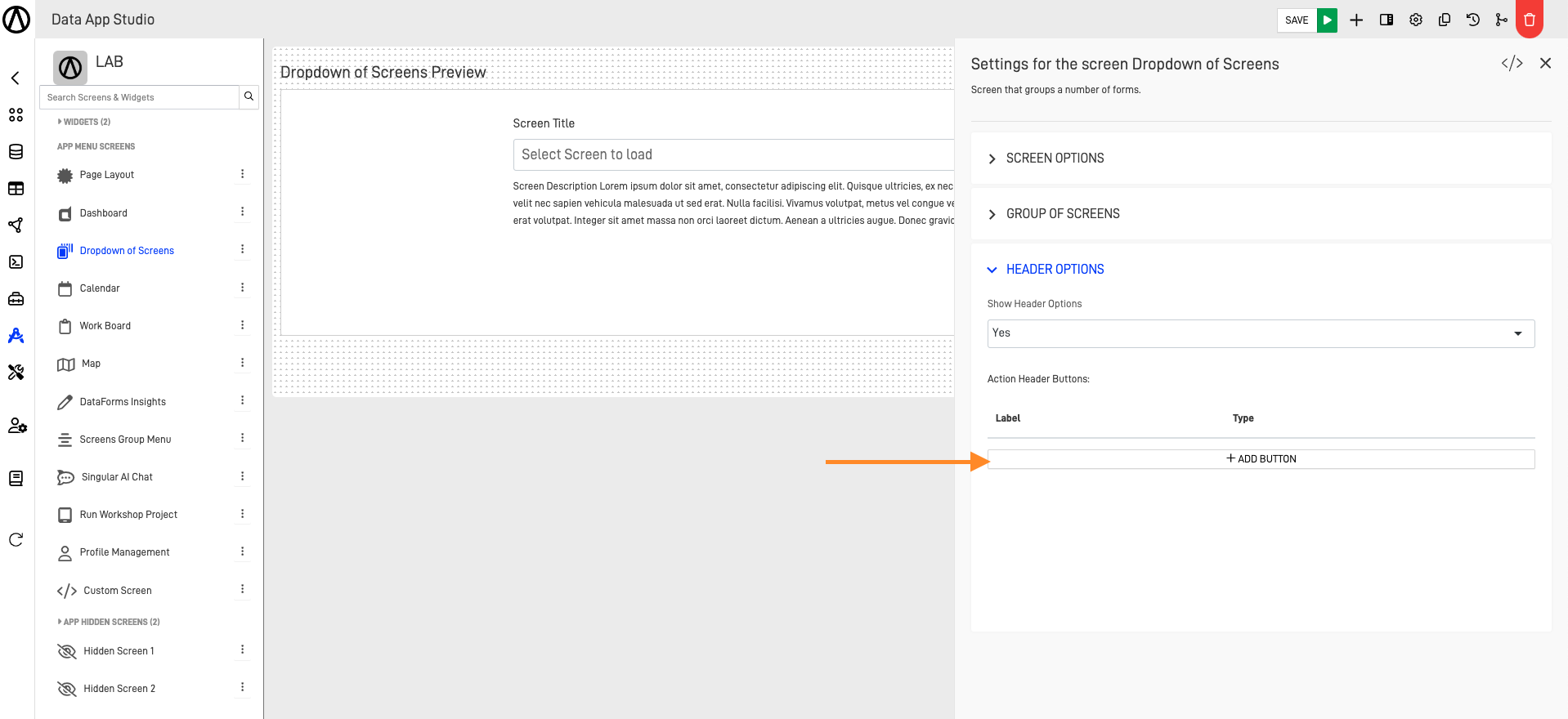
To show the header, select the "Show Header Options". A dropdown menu will prompt, and we select the "Yes" option.
Then click on the "+ ADD BUTTON".
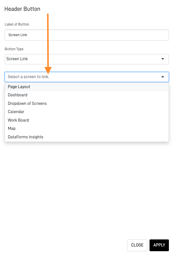
The header button form will prompt where we can customize our button, starting with the button label and then the button type. There are 2 types: Screen Link and URL Link.
- For Screen Link:
The Screen Link will be the default type selected in the button type. Click on the field below to open a dropdown menu showing all the screens available in our Data App. Click on the desired screen. After customizing the button, click on "APPLY".
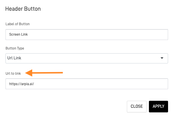
- For URL Link:
First, select the URL Link by clicking on the button type field. A dropdown menu will show the 2 available types; click on "URL link". This will change the field below to a new field called "URL to link", where we can enter our external URL. After finishing the process, click on "APPLY".
We can see all the buttons we have created for the header in the "Action Header Buttons" section.
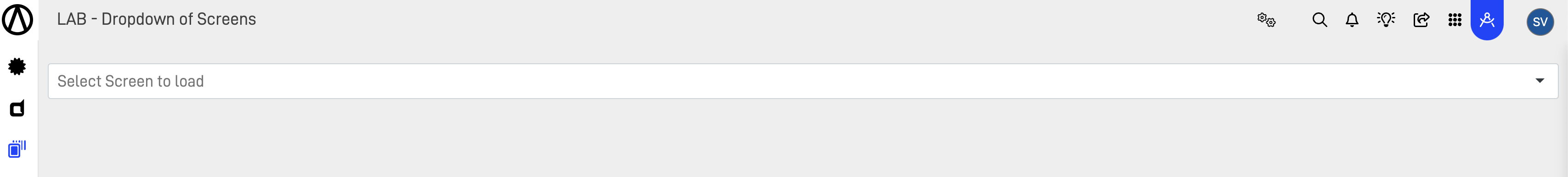
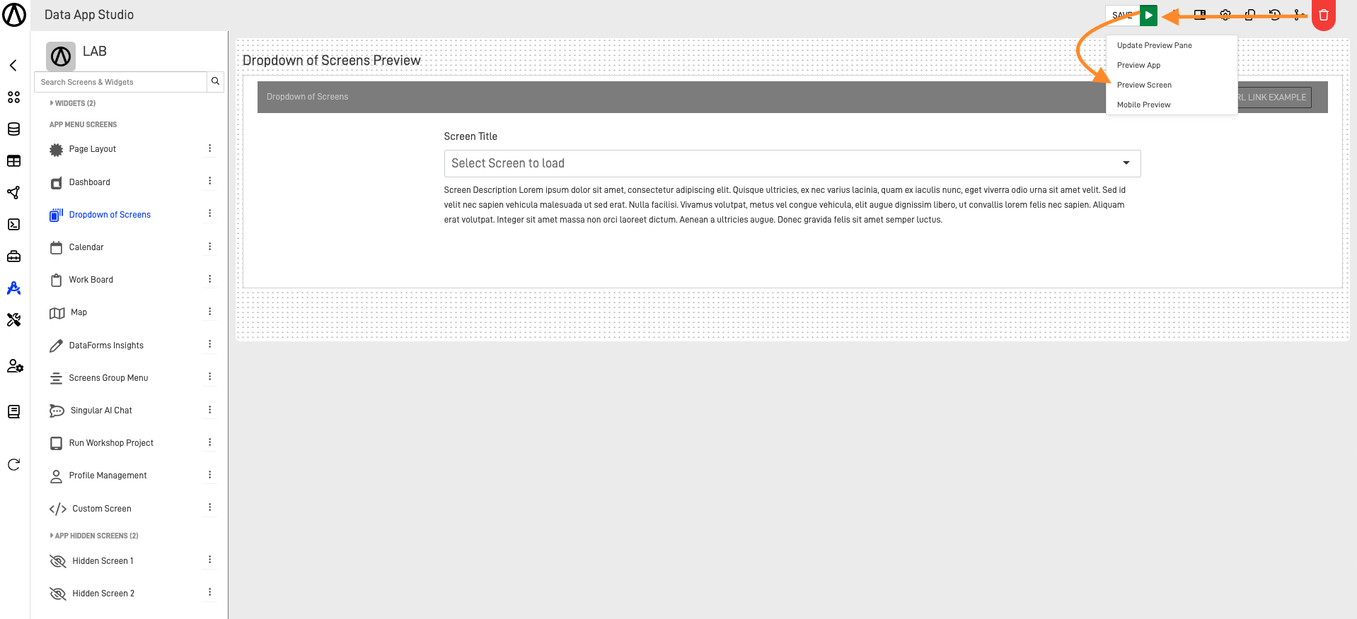
Step 4: Preview Your Result
After finishing every configuration of the Dropdown of Screens, we can preview its functions and customization by clicking on the arrow next to the "SAVE" button on the top right corner of the screen.
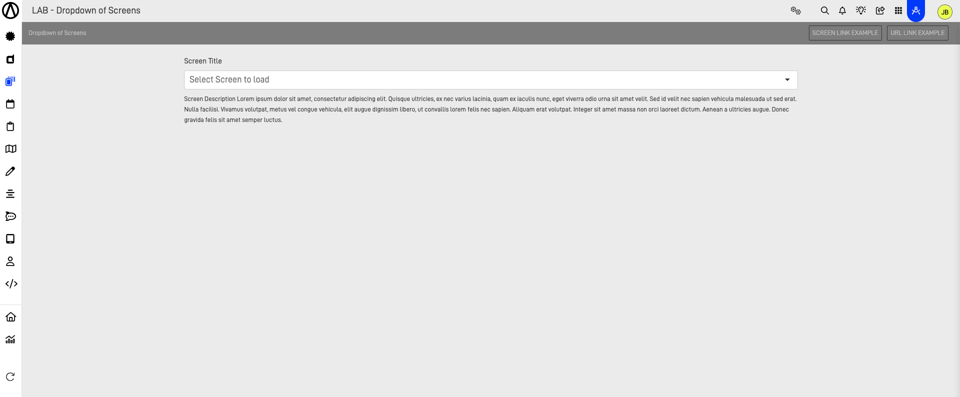
Then it will be visualized in the application.
Updated almost 2 years ago