
Page Layout
🛠️ Page Layout Objects Overview
The Page Layout screen is the foundation for building structured and dynamic interfaces within a DataApp.
Objects define the framework — such as rows, filters, and actions — while Elements populate that framework with interactive content.
Together, they let you design flexible layouts that combine data, filters, and user controls seamlessly.
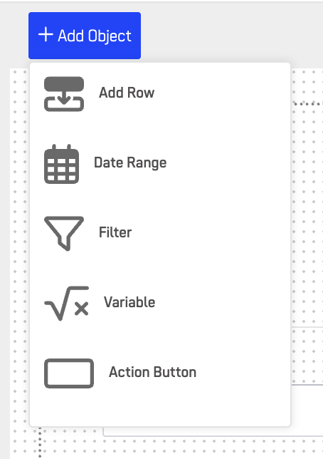
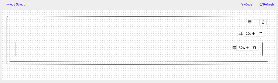
➕ Add Row
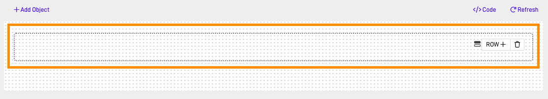
The Add Row object is essential for structuring Page Layout designs. It allows you to add rows where multiple elements can be placed efficiently.
⚙️ Configuration
| Setting | Description |
|---|---|
| Columns | Choose between 1–12 columns per row |
| Row Height | Automatically adjusts or can be set manually |
| Alignment | Left, Center, or Full Width |
| Responsive | Adapts automatically to screen size |
💡 Use Case
Use Add Row to organize dashboards, multi-section layouts, or step-based workflows before inserting content elements.
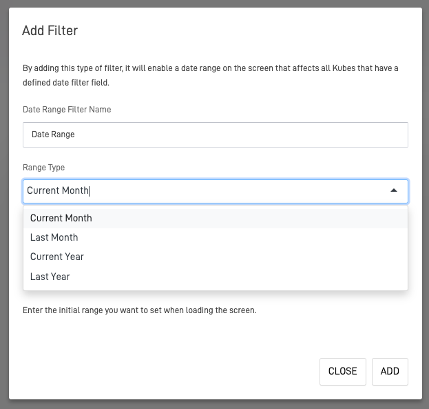
📅 Date Range
The Date Range object serves as a dynamic filter that allows users to select a specific date range. It affects all Nodes with a defined date field.
⚙️ Configuration
| Setting | Description |
|---|---|
| Default Range | Current Month, Last Month, Current Year, Last Year |
| Custom Ranges | User-defined date selection |
| Binding | Link to Node fields with date attributes |
💡 Use Case
Ideal for analytics dashboards, reports, or historical data views.
Tip: Combine with Dashlet Kube or Data Table to update visualizations in real time based on date filters.
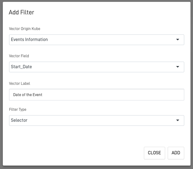
🔍 Filter
The Filter object customizes filters for the screen, using a Node as the data source. You can configure filter types for specific needs.
🔧 Filter Types
- Selector: Choose from predefined dataset values.
- Search Box: Enter text manually.
- Number: Filter by numeric value.
- Number Range: Define minimum and maximum range.
⚙️ Configuration
| Option | Description |
|---|---|
| Data Source (Node) | Defines the dataset to filter |
| Field Binding | Connects to a specific Node field |
| Type | Selector, Search Box, Number, Number Range |
| Placeholder Text | Custom label for user guidance |
Note: Ensure filters are connected to the same Node as the elements you want to affect.
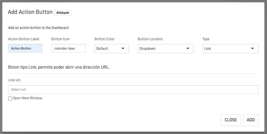
🔘 Action Button
The Action Button object allows you to add buttons that trigger actions such as navigation, API calls, or executing custom code.
⚙️ Configuration
| Option | Description |
|---|---|
| Type | Link, Screen Navigation, or Custom Code |
| Label | Text displayed on the button |
| Icon & Color | Optional styling customization |
| Position | Choose where the button appears (Top, Center, Bottom) |
💡 Use Case
Use Action Buttons for navigation shortcuts, data refresh, or workflow actions.
Tip: When using custom code, ensure scripts are scoped to the screen to avoid global conflicts.
🧩 Page Layout Elements
The Page Layout Elements define the content within your screen — from text and buttons to dynamic data components.
They help create a visually rich, interactive, and data-driven experience.
🏗️ Row
The Row element helps in nesting rows within row containers, organizing layouts efficiently.
Use nested rows for grouping related components together.
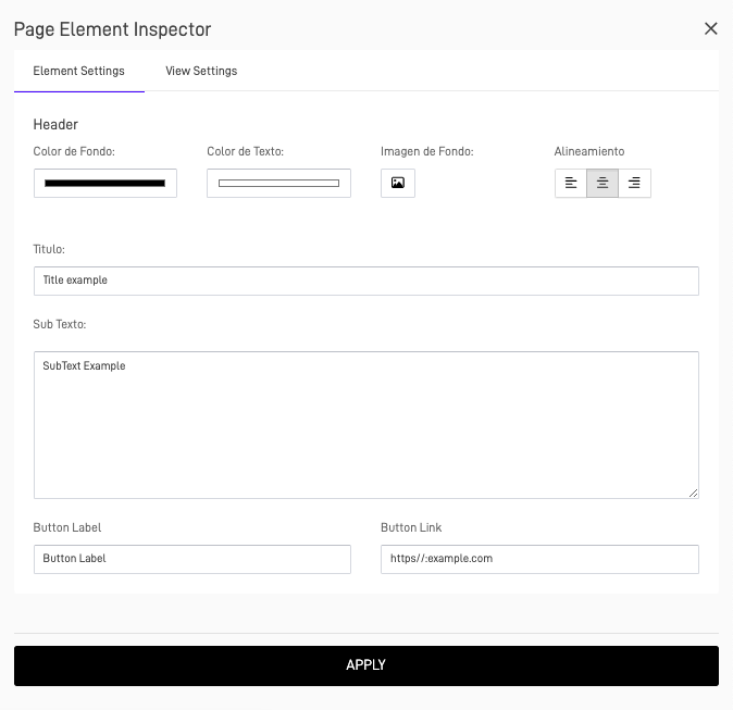
🏷️ Header
Adds a header with titles, subtexts, and optional background colors. You can also add a button linking to an external URL.
⚙️ Configuration
| Setting | Description |
|---|---|
| Title & Subtitle | Text to display |
| Background Color | Optional background styling |
| Alignment | Left, Center, or Right |
| Linked Button | Optional external link |
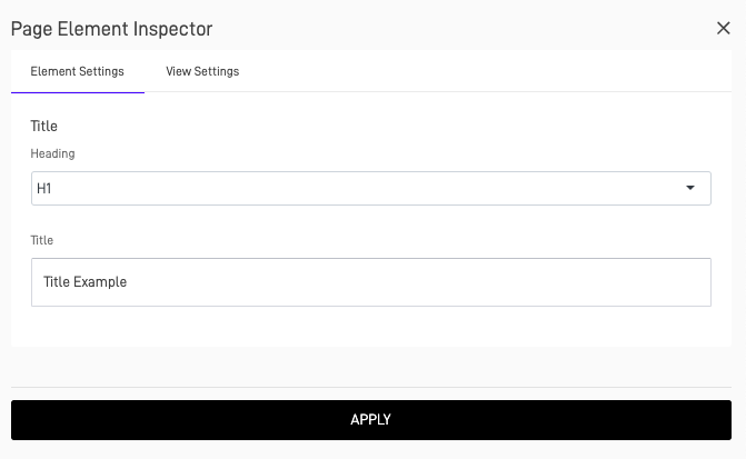
🖋️ Title
The Title element lets you insert titles with different heading sizes (H1–H6).
H1 and H2 automatically render in uppercase for visual consistency.
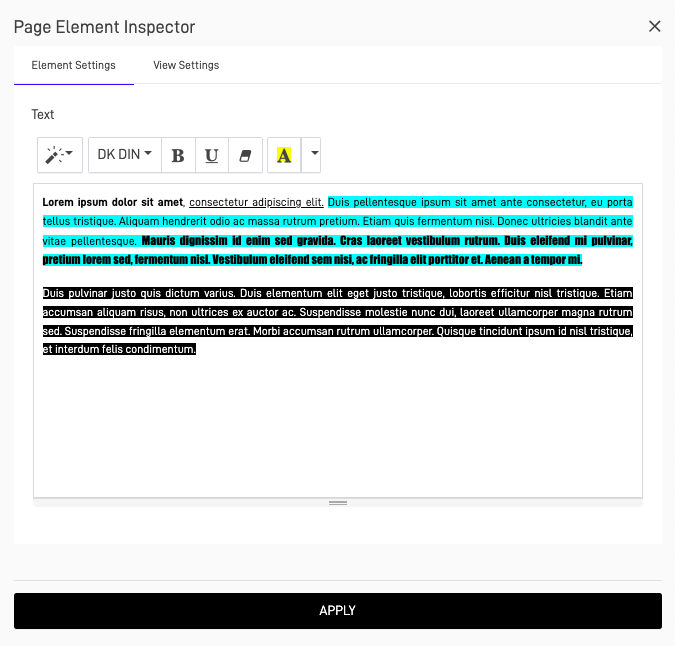
📄 Text
The Text element allows you to insert formatted paragraphs.
⚙️ Configuration
| Option | Description |
|---|---|
| Font Family | Choose typography style |
| Text Styles | Bold, Italic, Underline |
| Background Color | Optional highlight |
| Font Color | Customize text color |
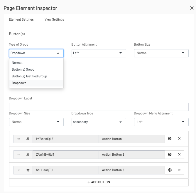
🔘 Button(s)
Adds single or grouped buttons.
Button Styles
- Normal: Single action.
- Button Group: Several actions side-by-side.
- Justified Group: Buttons fill available width.
- Dropdown: Display secondary actions.
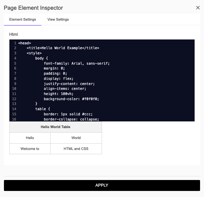
🌐 HTML
The HTML element lets you inject custom HTML/CSS for advanced customization.
Note: Avoid inline JavaScript unless necessary — use DataApp’s scripting areas for logic.
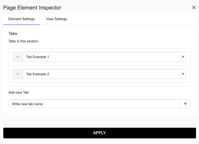
🗂️ Tabber
Creates tabs for organizing content efficiently inside a single layout.
⚙️ Configuration
| Option | Description |
|---|---|
| Tab Titles | Define labels for each tab |
| Content Binding | Assign elements or nodes per tab |
| Active Tab | Choose which tab opens by default |
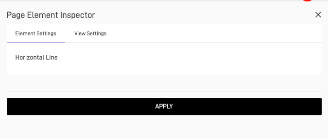
➖ Horizontal Line
A simple divider that helps separate content visually.
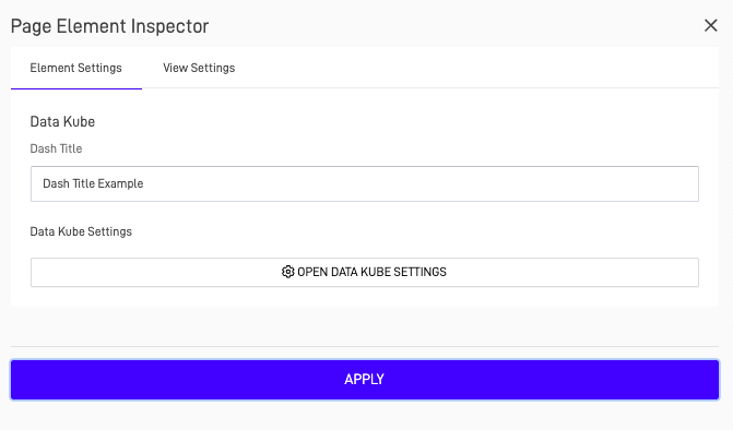
📊 Dashlet Kube
Adds a Knowledge Graph visualization directly into your layout. Perfect for presenting key data insights or relationships.
⚙️ Configuration
| Option | Description |
|---|---|
| Node Connection | Choose which Node to visualize |
| Kube Settings | Define title, color scheme, and filters |
| Data Refresh | Auto or manual |
📋 Data Table
Displays data in a structured tabular format connected to a Node.
⚙️ Configuration
| Option | Description |
|---|---|
| Data Source (Node) | Define which dataset to display |
| Columns | Choose which fields appear |
| Editable Rows | Enable inline editing |
| Pagination | Optional row limits per page |
Tip: Combine Data Table with Filters and Date Range for fully interactive data views.
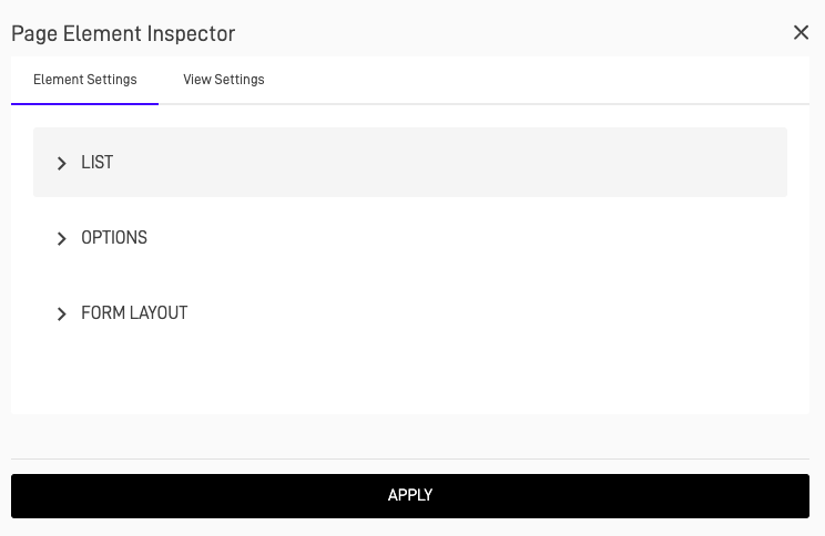
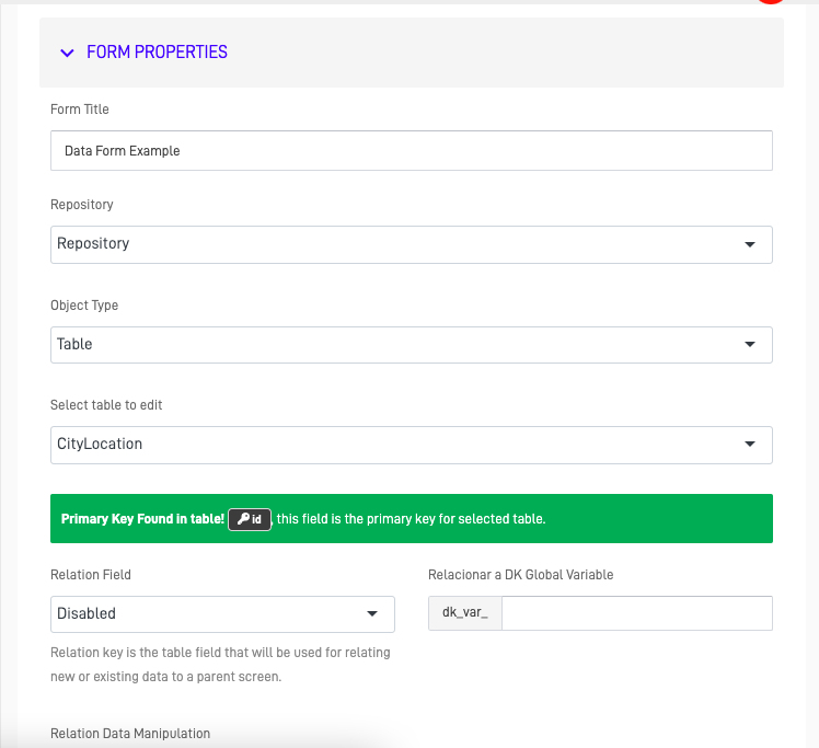
📑 Form
The Form element enables data entry or updates using a repository connection.
⚙️ Configuration
| Option | Description |
|---|---|
| Repository | Data destination or source |
| Submit Options | Save, Validate, or Trigger Automation |
| Layout | Single-column or multi-column form |
| Custom Styling | CSS classes for fields and labels |
🔚 Conclusion
The Page Layout toolkit provides a complete set of objects and elements to design dynamic, data-rich, and interactive screens in your DataApp.
From structural controls like rows and filters to content elements like tables and forms, everything is built for flexibility and real-time data interaction.
Pro Tip: Plan your layout before adding elements — define the structure with rows and filters first, then connect Nodes to make your screens fully interactive.