How to configure the View Settings?
Step-by-Step Guide: View Settings
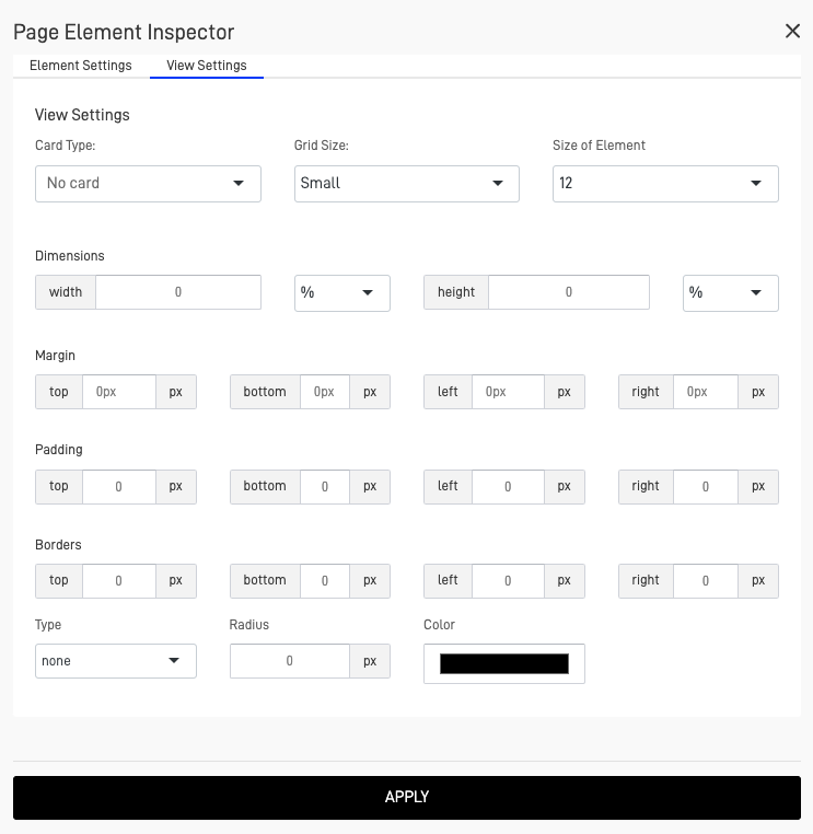
The majority of screens, objects, and elements within the Page Layout Screen feature a "View Settings" configuration. This configuration allows you to adjust the grid size, element size, element dimensions, margins, padding, and borders.

-
Card Type: Configure the view card type, this define a card as background of the element.
- No Card: Show the object with no configuration card or view.

- Bordered Card: Show the element with a bordered card as background.

- Card without border: Show the element with a card with no border as background.

-
Grid Size: Change the grid size of the element, this range from "Extra Small" to "Extra Large".
-
Size of the Element: Customize the width size of the element, range from 1 to 12.
-
Width:Customize the width size, this can be in % or in pixels.
-
Height: Customize the height size, this can be in % or in pixels.
-
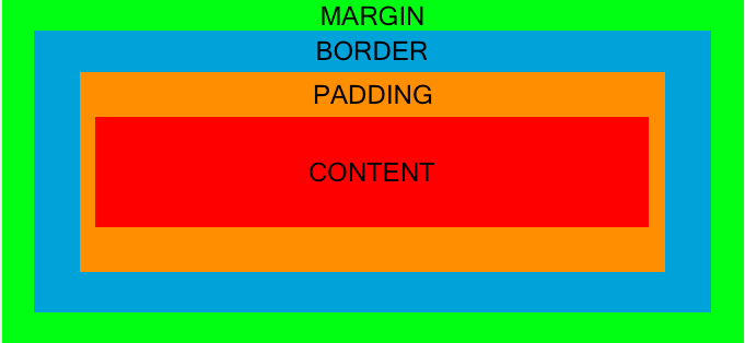
Margin, Padding, and Borders: You can customize the size of these elements relative to each other. Each side—top, bottom, left, or right—can be adjusted individually, with all measurements in pixels.
- Margin: Represents the external space of the element, controlling the space between the element and other external elements.
- Border: Represents the line that surrounds the padding and content. Its width can be customized.
- Padding: Represents the space between the border and the content, controlling the internal space around the content.

- Type: Customize the type of border, this can be solid, dotted, double and dashed.
- Radius: Customize the radius of the border in pixels.
- Color: Customize the color of the border.
Updated over 1 year ago
