How to use the Map Screen?
Step-by-Step Guide: Map Screen
In this step-by-step guide, we will show you how to use the map scree and all the configuration and customization options that are available for it.
The Map screen is a very straight-forward screen, here we can setup Data Layers that we can visualize on the map the Map configuration is divide in four main tabs: "Data Layers", "Filters" , "Map Settings" and "Header Options"
Map Integration
To be able to visual the Map in this screen you will need to have the "MapBox" Integration token, you can access the Integrations documentation for more information.
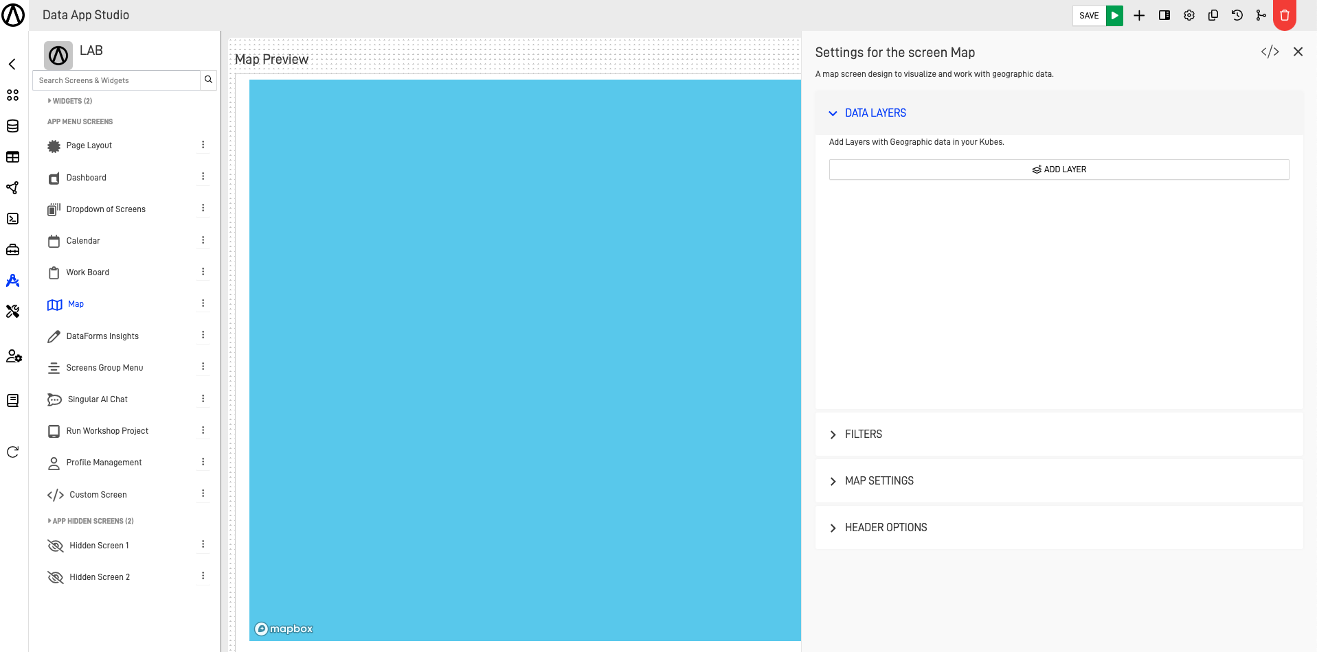
Step 1: Configure the "Data Layers"
First, we are going to configure the "Data Layers" section, in here we can add multiple geographic data in our Nodes as layers to be able visualize it in our Map. The first step to add a layer will be to click on the "Add Layer" button.
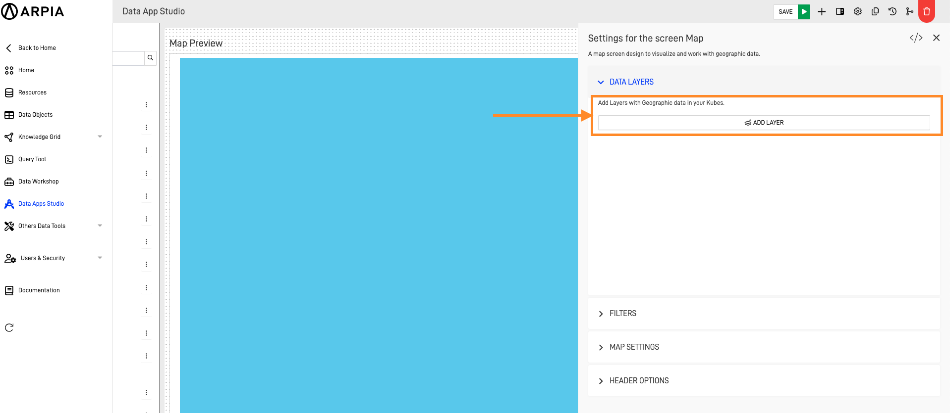
This will prompt the "Add Data Layer" form:
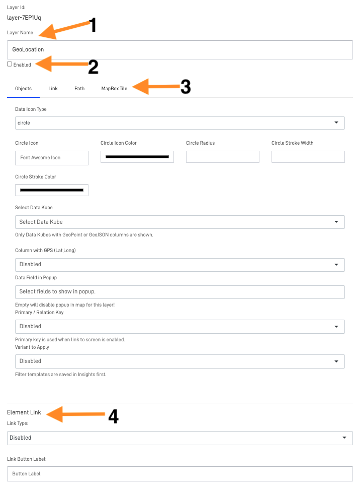
This configuration screen will be providing you with the layer Id. Here you can also configure the:
- Layer Name(1): This name will server as the title for the Data Layer
- Enable checkbox(2): This checkbox will determine if the Data Layer is enable or not to appear on this map, this is helpful is we have multiple data layers and we only want the user to be able to see specific ones.
- Data Layer type(3): The type of data layer we are going to add, this could be an object, link, path or a MapBox Tile.
- Element Link(4): This allows to use an action button to link an application screen or external URL.
Data Layers Types
Here are explained each of the Data Layers types available:
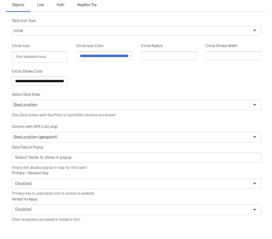
Objects
Objects work as cumulative Dots in the map, this mean if we zoom out and and 2 dots are next to each other being from the same Data Layer, they will ad, this is helpful to visualize information depending on the scale we want to analyze. The available fields for configuration are:
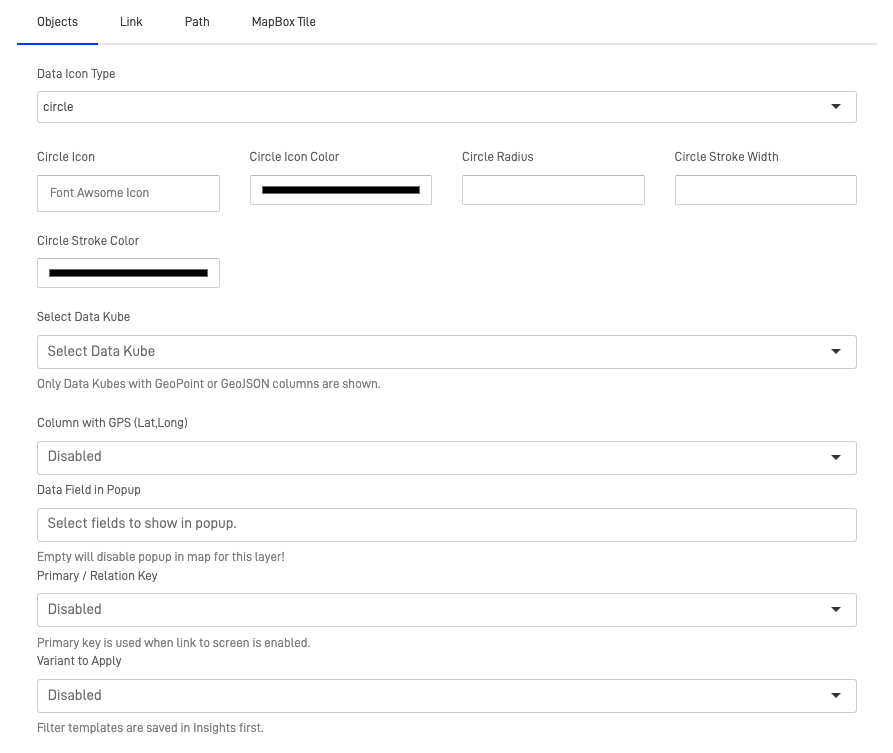
- Data Icon Type: Here we can select how the object is going to be visualize in the map, there are multiple options that range from circles, diamonds, triangles, inverted triangles, rectangles and more.
In case the Icon Type is a Circle these are the available configuration options:- Circle Icon: Customize the circle icon, being able to adopt a Font Awesome Icon.
- Circle Icon Color: Customize the icon color.
- Circle Radius: Customize the radius of the circle in pixels.
- Circle Stroke Width: Customize the thickness of the circle's border by adjusting the line width in pixels.
- Circle Stroke Color: Customize the color of the circle's border.
In case the Icon Type is any other Shape, these are the available configuration options: - Marker Image Size: Customize the image size in pixels.
- Text Color: Customize the text's font-color.
- Select Data Kube: Select the Node from where you want to take the Geographic data information. (Only Data Kubes with GeoPoint or GeoJSON columns are shown).
- Columns with GPS: Select the Column from the node which have the Geographic data.
Geographic Format
The Geographic Data should have (Latitude,Longitude) format. E.g (0.00000,0.00000)
- Data Field in Popup: Select one or multiple fields from the Node that will show in the Popup of the Object, is left empty will disable the popup for this layer.
- Primary / Relation Key: Select the primary key of the Node, this is mainly use a link to another screen is enable.
- Variant to Apply: Select any variant you wish to apply to the Node.
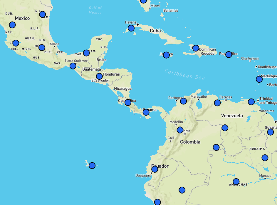
Example:


Updated over 1 year ago
