
Dashboard
🖥️ Dashboard Objects Overview
The Dashboard Screen in DataApps provides a modular and interactive environment for data visualization.
Using objects such as titles, filters, and the Kube Dashlet, you can design dashboards that adapt to different analytical and monitoring needs.
When an object is added, its container appears on the Dashboard screen. Each object includes a gear icon ⚙️ for accessing configuration settings.
📖 Quick Navigation
- Title
- Text
- Kube Dashlet
- Empty Container
- Date Range
- Filter
- Variable
- Tab Section
- Action Button
- Data Table
- Data Map
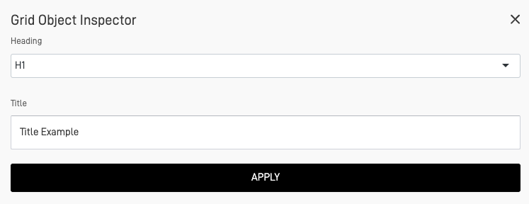
🏷️ Title
The Title object adds a heading or section title to the dashboard. It supports multiple sizes, from H1 (largest) to H6 (smallest), allowing consistent hierarchy across your screen.
⚙️ Configuration
| Setting | Description |
|---|---|
| Size | Select between H1–H6 |
| Alignment | Left, Center, or Right |
| Color | Optional text color customization |
| Font Weight | Regular or Bold |
💡 Use Case
Use for section titles, chart headings, or data grouping headers.
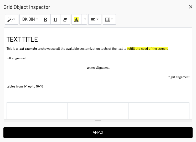
✍️ Text
The Text object lets you insert descriptive text blocks or explanations.
It includes formatting controls like bold, italic, underline, and the ability to add tables.
⚙️ Configuration
| Setting | Description |
|---|---|
| Text Style | Bold, Italic, Underline |
| Alignment | Left, Center, or Justified |
| Highlighting | Background or text color options |
| Tables | Add structured information inline |
💡 Use Case
Ideal for adding contextual information, descriptions, or summaries above charts.
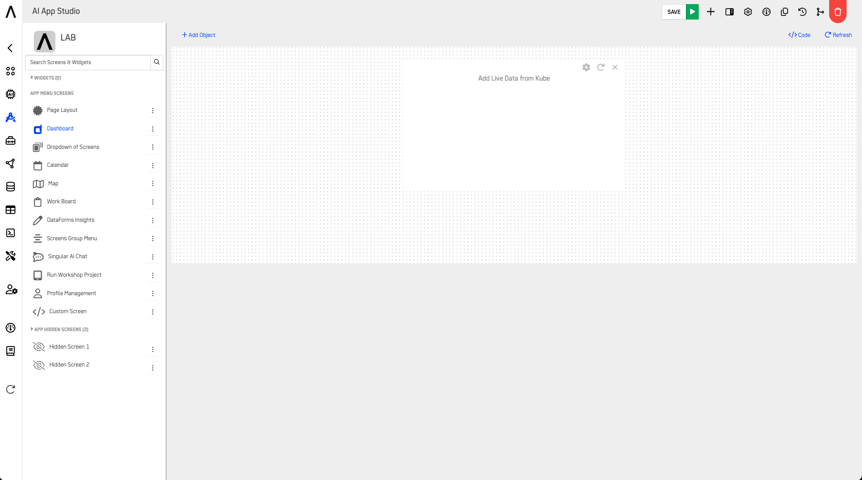
📊 Kube Dashlet
The Kube Dashlet is the core visualization object of a Dashboard Screen. It connects to Nodes and displays configured Insights, enabling powerful and flexible data visualization.
Insights
Learn more in the Insights Documentation.
⚙️ Configuration
| Setting | Description |
|---|---|
| Node Source | Select the Node providing data |
| Insight Type | Chart, Counter, Table, or Custom |
| Metrics & Dimensions | Define the displayed data fields |
| Filters | Apply Node-level data filters |
| Refresh Interval | Optional automatic data refresh rate |
💡 Use Case
Use Kube Dashlets to visualize performance metrics, KPIs, or trend analysis.
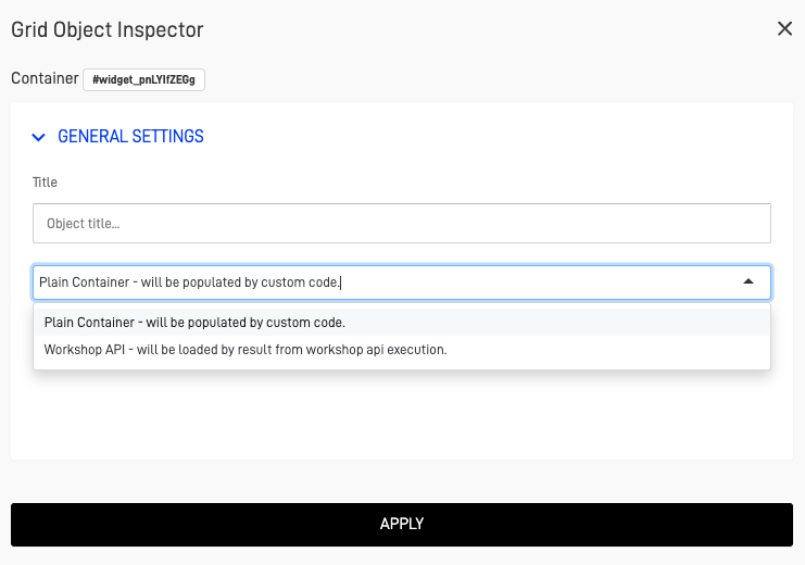
🧩 Empty Container
The Empty Container is an advanced component that serves as a data target.
It can receive and display information through custom code or via a Workshop API.
⚙️ Configuration
| Setting | Description |
|---|---|
| ID Reference | Unique identifier for targeting updates |
| Data Source | Link with API endpoint or custom script |
| Visibility | Show/Hide dynamically based on conditions |
💡 Use Case
Use this when building dashboards that dynamically render data from external API calls or Workshop outputs.
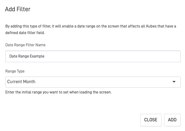
📅 Date Range
The Date Range object acts as a global date filter.
It controls the date range for all Nodes containing a date field.
⚙️ Configuration
| Setting | Description |
|---|---|
| Default Range | Current Month, Last Month, Current Year, or Last Year |
| Label | Display name for the filter |
| Linked Nodes | Choose which Nodes respond to this filter |
💡 Use Case
Ideal for dashboards displaying time-based analytics or reports.
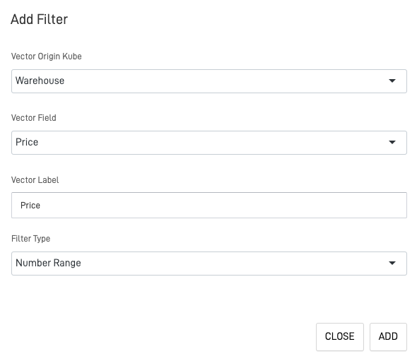
🔍 Filter
The Filter object enables dashboard-level data filtering based on Node fields.
You can specify which Node columns or vectors to filter, and define how the user interacts with them.
⚙️ Configuration
| Setting | Description |
|---|---|
| Node | Select the Node providing filter data |
| Filter Type | Selector, Search Box, Number, or Range |
| Field Name | Column or vector to filter |
| Label | Custom name shown on the dashboard |
Tip: Combine Filters with the Date Range for powerful cross-filtered views.
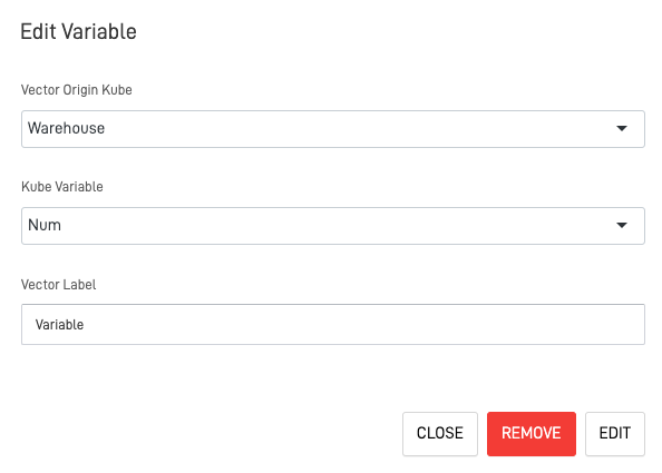
🔧 Variable
The Variable object enables creation of global or local variables that can be shared between different dashboard views.
These variables allow dynamic content rendering and adaptive logic.
⚙️ Configuration
| Setting | Description |
|---|---|
| Variable Name | Identifier for referencing in logic or scripts |
| Default Value | Initial value assigned |
| Scope | Local (this dashboard) or Global (across screens) |
| Bindings | Elements or components that use this variable |
💡 Use Case
Use Variables to manage user selections, dynamic themes, or parameterized queries.
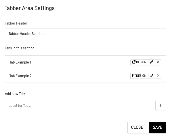
🗂️ Tab Section
The Tab Section (Tabber) object organizes data into separate tabs, each containing visualizations, Kubes, or tables.
This helps declutter dashboards and improve readability.
⚙️ Configuration
| Setting | Description |
|---|---|
| Tab Titles | Define custom tab names |
| Active Tab | Select which tab opens by default |
| Content Binding | Assign Kubes or elements per tab |
| Style | Choose between horizontal or vertical layout |
💡 Use Case
Use to separate data categories (e.g., Sales, Operations, Finance) within one dashboard.
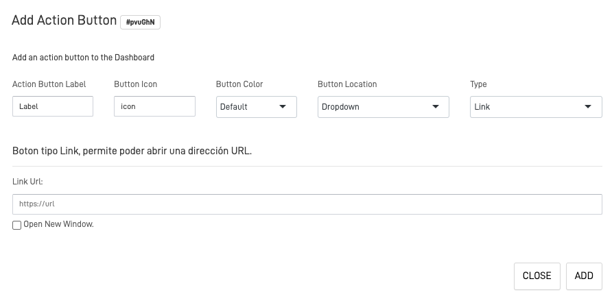
🔘 Action Button
The Action Button adds interactivity to dashboards, allowing navigation or workflow triggers.
You can assign different button types, icons, and actions.
⚙️ Configuration
| Setting | Description |
|---|---|
| Action Type | Link, Screen Navigation, or Custom Code |
| Label | Button text |
| Icon & Color | Visual customization |
| Position | Define placement on screen (Top, Center, Bottom) |
💡 Use Case
Use for navigation, data refresh, or executing pre-defined scripts.
📋 Data Table
The Data Table displays Node data in tabular form.
It offers three configuration panels for control and customization.
⚙️ Configuration Tabs
| Tab | Description |
|---|---|
| List | Define which data fields appear |
| Options | Control visibility, sorting, and pagination |
| Form Layout | Customize table design and structure |
Tip: Combine with Filters and Variables for real-time data interaction.
🗺️ Data Map
The Data Map integrates geospatial data visualization.
You can link Node-based geographic fields to a map for real-world data representation.
MapBox Integration
Learn more in the Integrations Documentation.
⚙️ Configuration
| Setting | Description |
|---|---|
| MapBox API Token | Required for rendering map layers |
| Node Source | Select Node containing latitude/longitude fields |
| Layer Style | Define color, marker type, and size |
| Zoom Level | Set default view distance |
💡 Use Case
Use to visualize geographic distributions, heatmaps, or region-based analytics.
🔚 Conclusion
The Dashboard Screen Objects give you complete control over data visualization and interactivity.
From dynamic filters to powerful visual Kubes, every object enhances usability and engagement.
Pro Tip: Start simple — combine 2–3 Kubes with filters and a date range. Then expand your dashboard with variables and tab sections for advanced layouts.
🔗 Related Guides
Updated 8 months ago