How to design a Data Form
Step-by-Step Guide
After creating your Data Form, you can personalize its design. This guide will explore all the available customization options in depth.
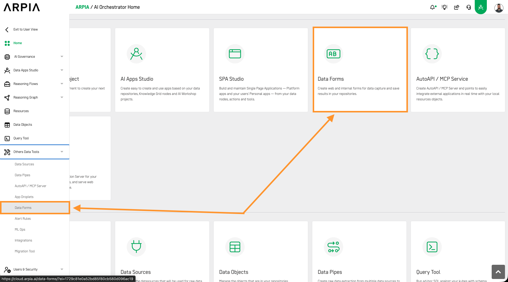
Step 1: Access the Data Forms section
From your Orchestrator Home screen, select the Data Forms option.
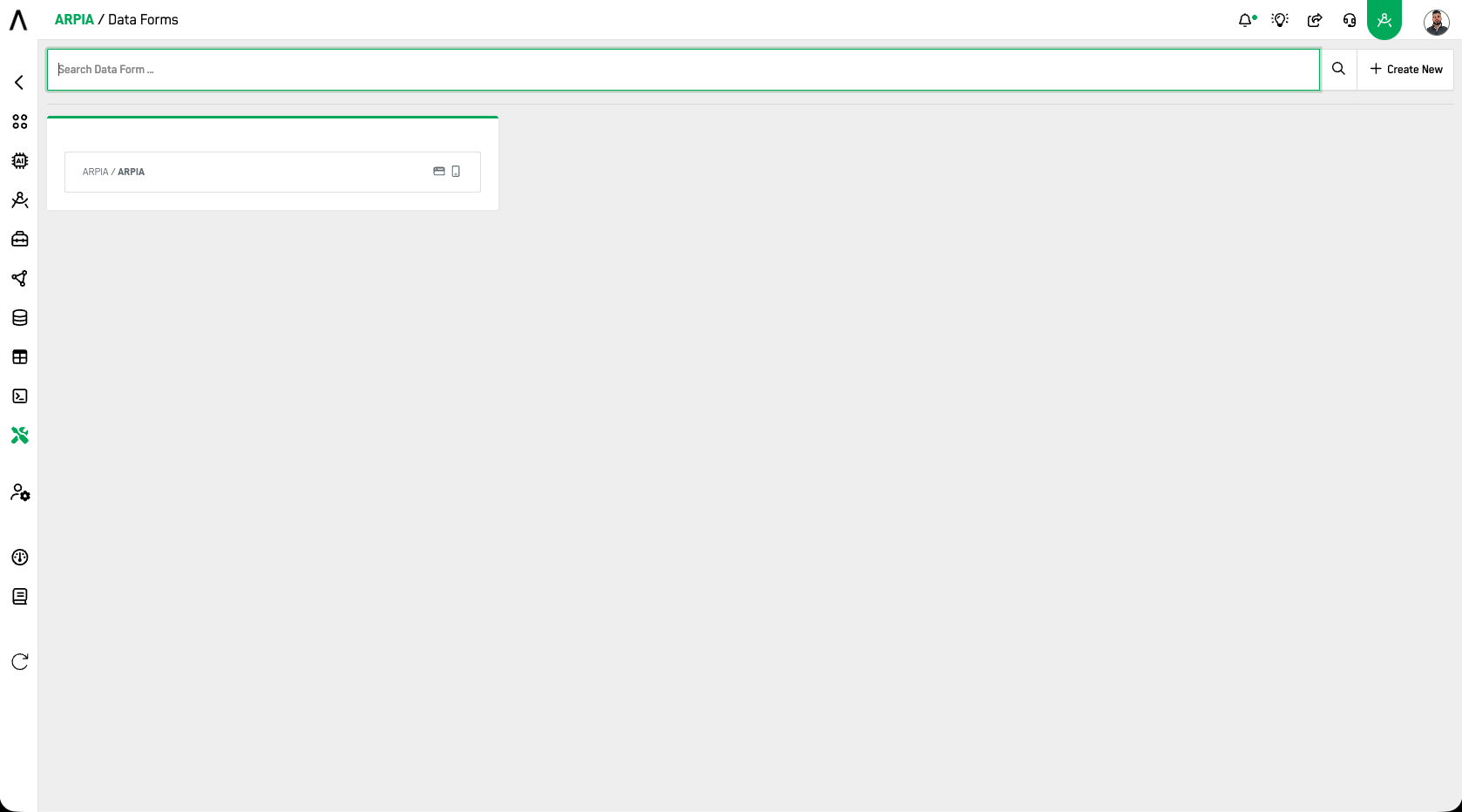
Step 2: Select the desired form to personalized (rewrite)
You will be directed to a new window displaying all the Data Forms you have created, listed by groups. Select the form you want to customize the design for.
Step 3: Select the Design Tab
In the new window, select the Design tab to access all available options for designing your Data Forms.
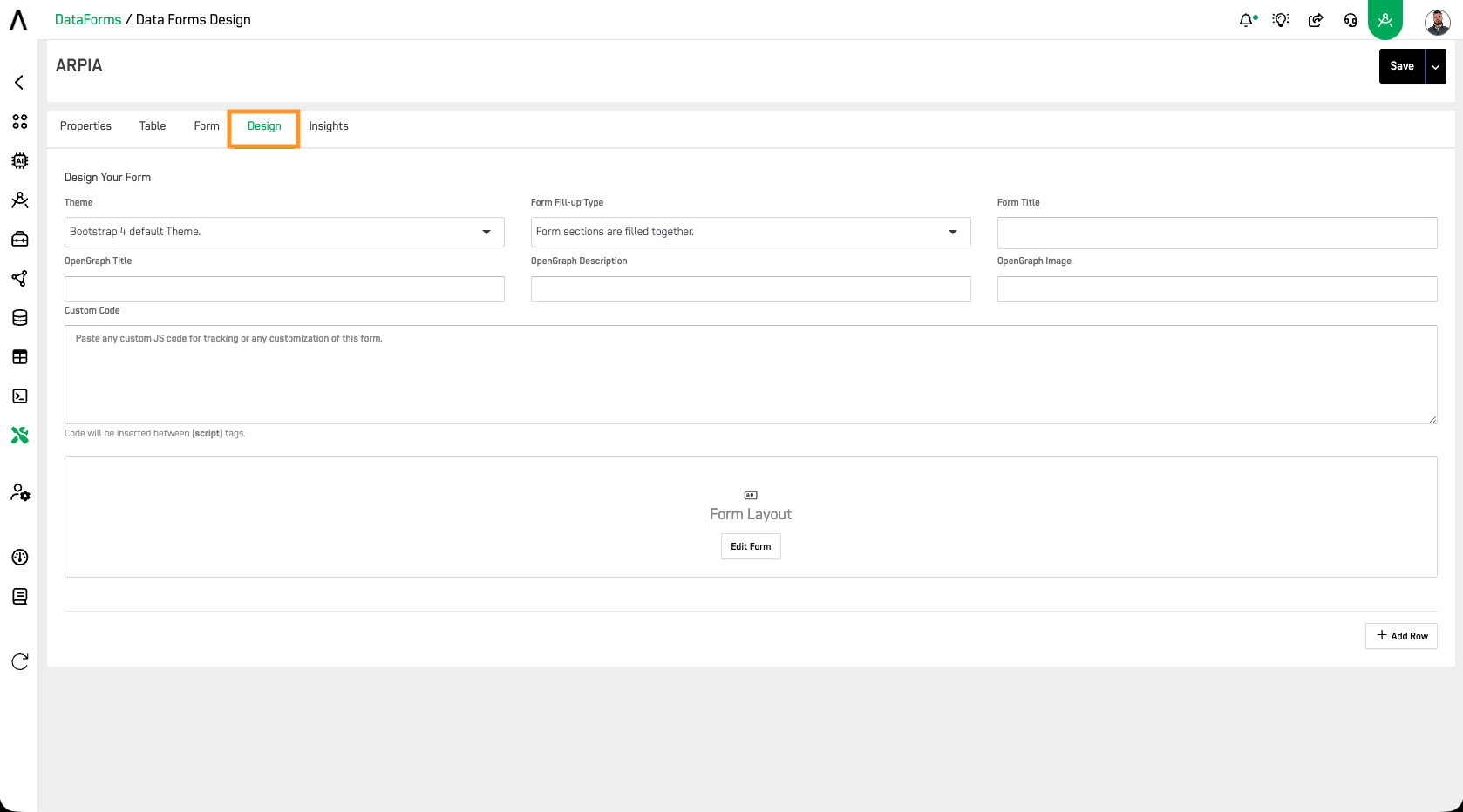
Step 4: Design Screen
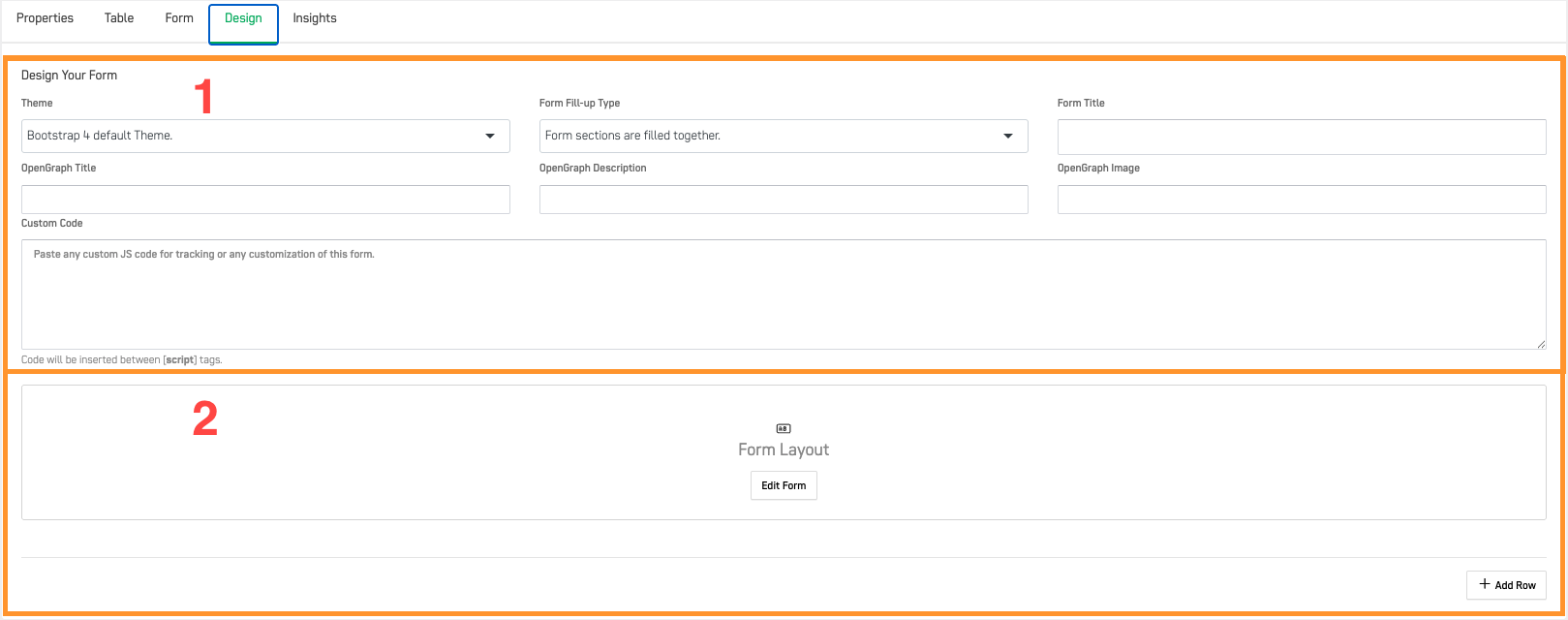
You will be directed to a new screen displaying the available options to design your form. In the image below, we have separated the design screen into two sections. The first section
(1) allows you to make overall changes to your form design, such as type, title, theme, and custom code. The second section
(2) lets you drag and drop different rows that you can manually add..
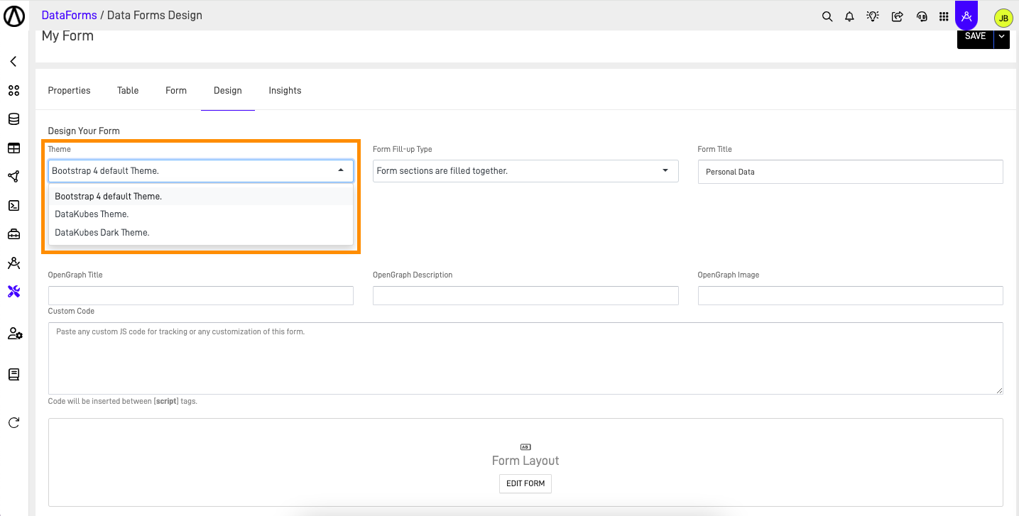
Step 5: Select your Form Theme
Forms Design offers three major themes to choose from for your form: Bootstrap 4 Default Theme, DataKubes Theme, and DataKubes Dark Theme..
We will show you an example of each one.
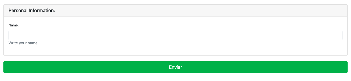
Bootstrap 4 default Theme
DataKubes Theme
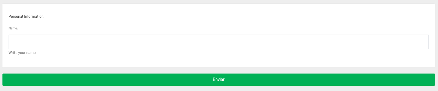
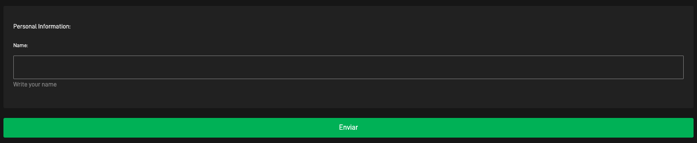
DataKubes Dark Theme
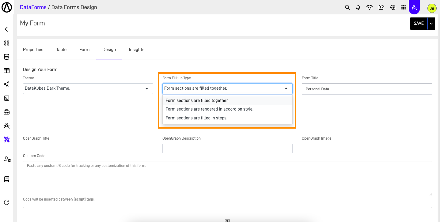
Step 6: Select Form Fill-up type
The next step is selecting the Form fill-up type. These design options change how the user will fill out the information in your form. The image below shows the available options..
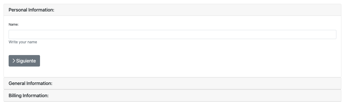
To provide better examples, we have added two extra sections to the form. If you want to learn how to do this, access the "How to create a Data Form" documentation.
Form sections are filled together
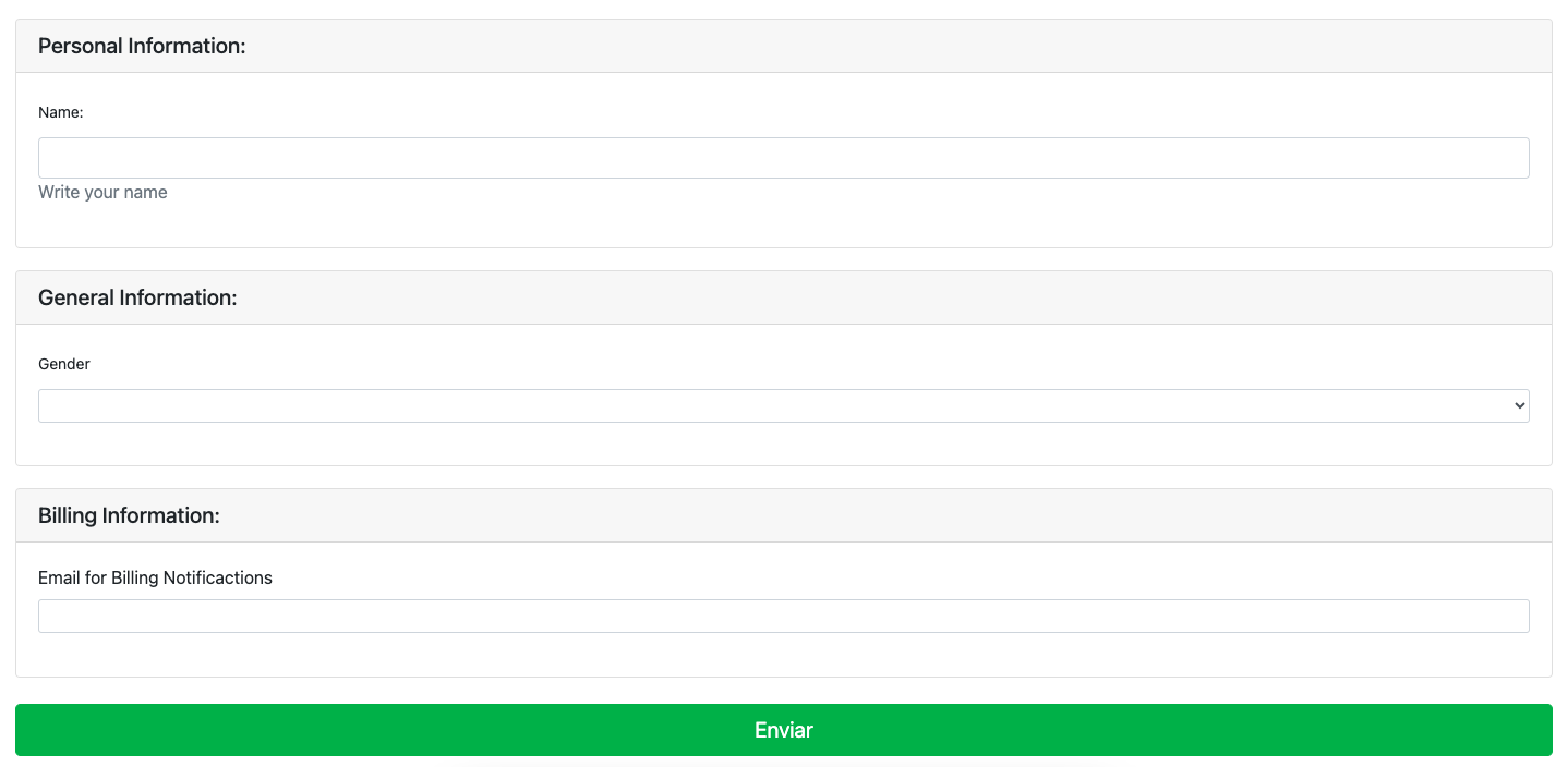
This form fill-up type displays all sections and their fields simultaneously, allowing the user to fill in the required information in any order they prefer.
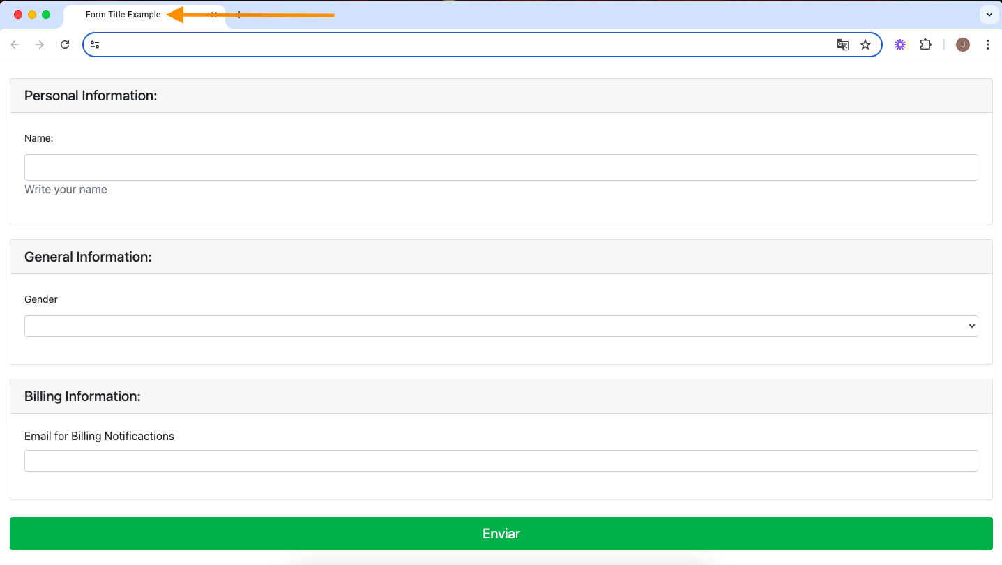
Form sections are rendered in accordion style
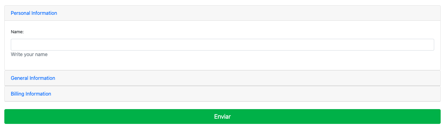
This type provides a natural fill flow, displaying each section in the designed order. It also allows users to jump to other sections freely. When a section is selected, the other sections close, helping the user focus only on the current form section.
Form sections are filled in steps
This type forces the user to follow the intended field flow for each section. The user can only proceed to the next section if all required fields in the current section are filled. Jumping between sections is not allowed; the user can only move to the next section in sequence.
Step 7: Write the Form Title
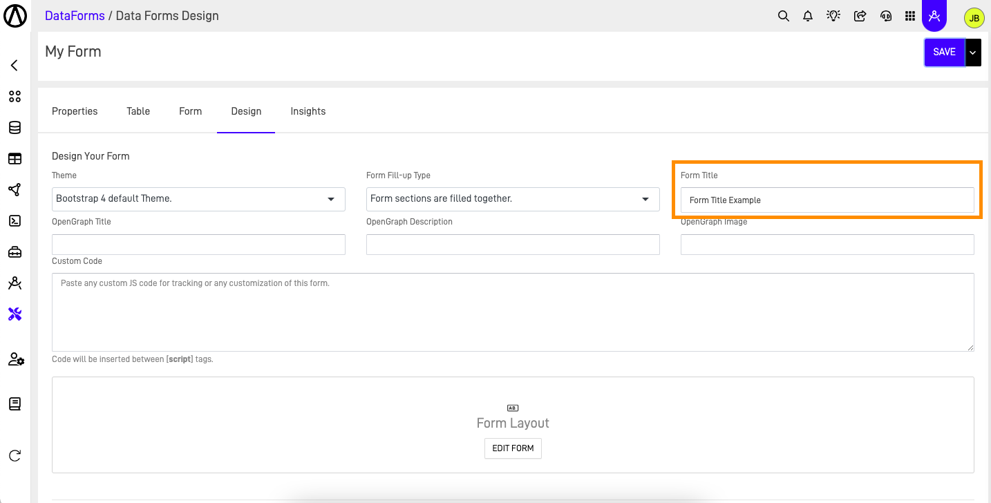
In the Form Title field you can change the name of the form tab, in this case we use as an example "Form Title Example" and you can see it in the image below.
Step 8: Add your OpenGraph information
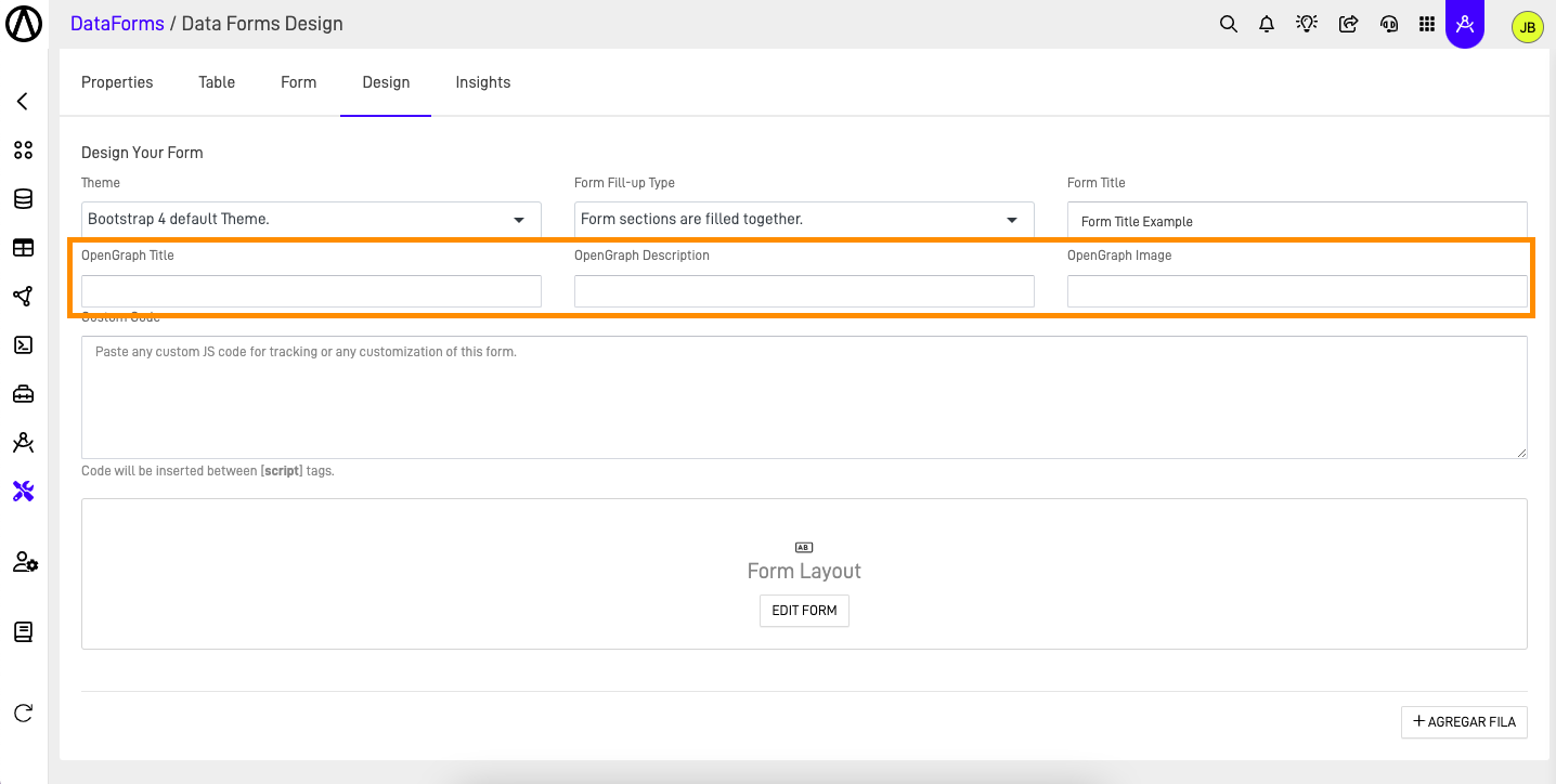
Add your OpenGraph title, description and image.
Step 9: Add your custom code
In the Custom Code section, you can add your custom JavaScript code, offering infinite options and possibilities. You can use it for anything from tracking code to custom personalization of the form. This code will be inserted within the tag in the HTML of the form.
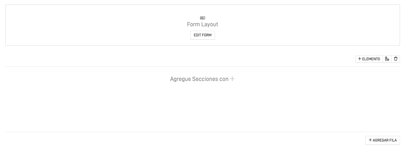
Step 10: Add new rows
In the design screen, you can view the Form Layout, which represents the entire form you designed in the Form tab. If you want to make changes to this design, you can do so by accessing the Form Tab or clicking the "Edit Form" button. Additionally, you can add additional rows next to this Form Layout to further personalize your design.
After adding a new row we can add a column depending on the size we desired, the available sizes are:
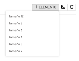
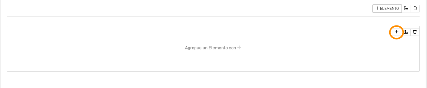
After selecting the desired size, in this case we use Size 12, you can add elements to this columns by clicking the "+" button.
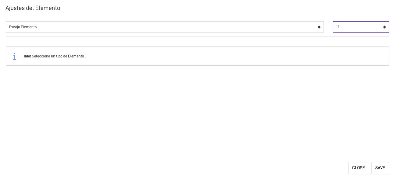
After clicking the button the "Adjust Element" screen will appear, in this screen we can select the type of element we want to add to the column. You can also change the previously selected size.
We will be explaining each of the elements available:
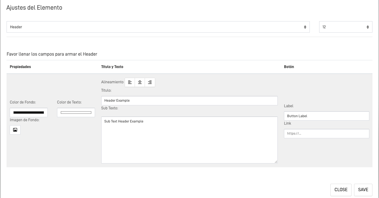
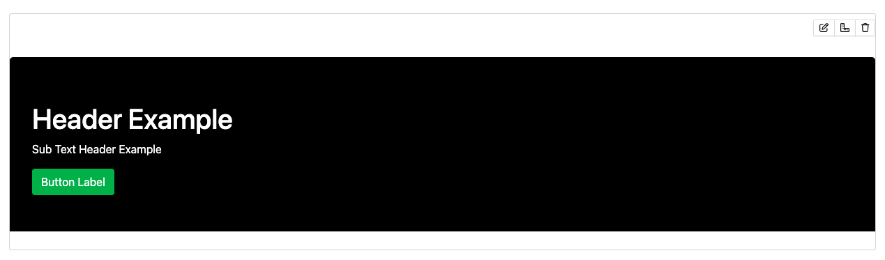
Header
This element allows you to add a header to your form. You can customize the header title and add a subtext. Additionally, you can include a button with a linked URL and personalize the button label. You also have the option to change the font color, background color, or add an image as a background.
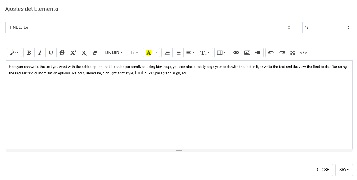
HTML Editor
This element let you add customize text to your form.
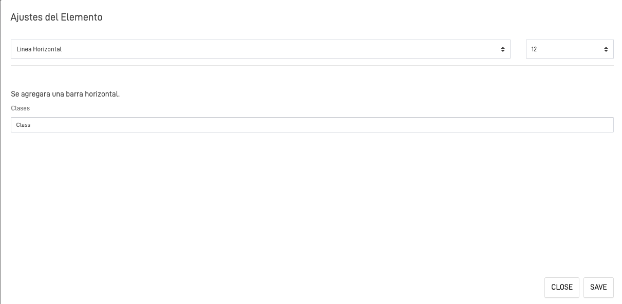
Horizontal Line
This element let you add a Horizontal line, optionally you can add a customize name for the class that you can later use in a Javascript code to further customize the line properties.
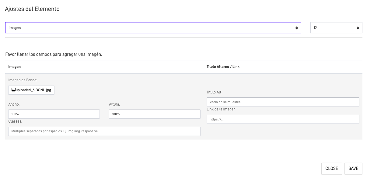
Image
This element, as its name suggests, allows you to add an image to your form. You can upload the image to your bucket or provide an image URL. Additionally, you can personalize the width and height in % or px..
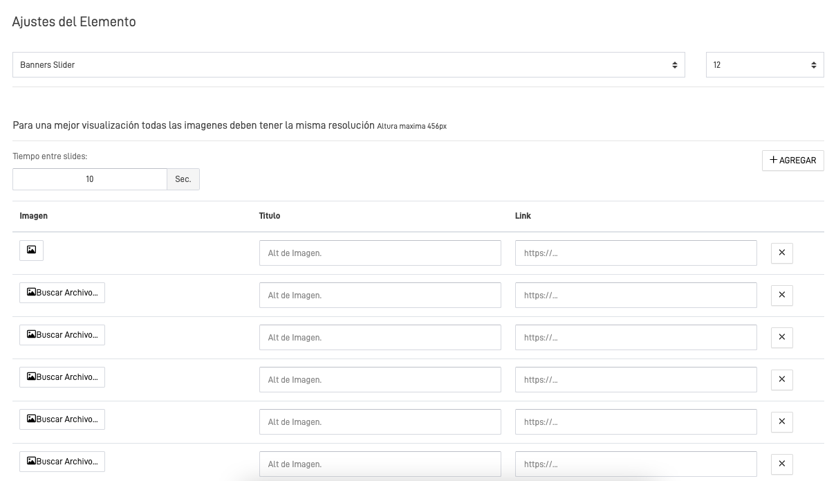
Banners Slider
This element allows you to create a slider of banners or images. You can customize the number of images and the duration between each slide. It is recommended that all images have the same size for optimal display.
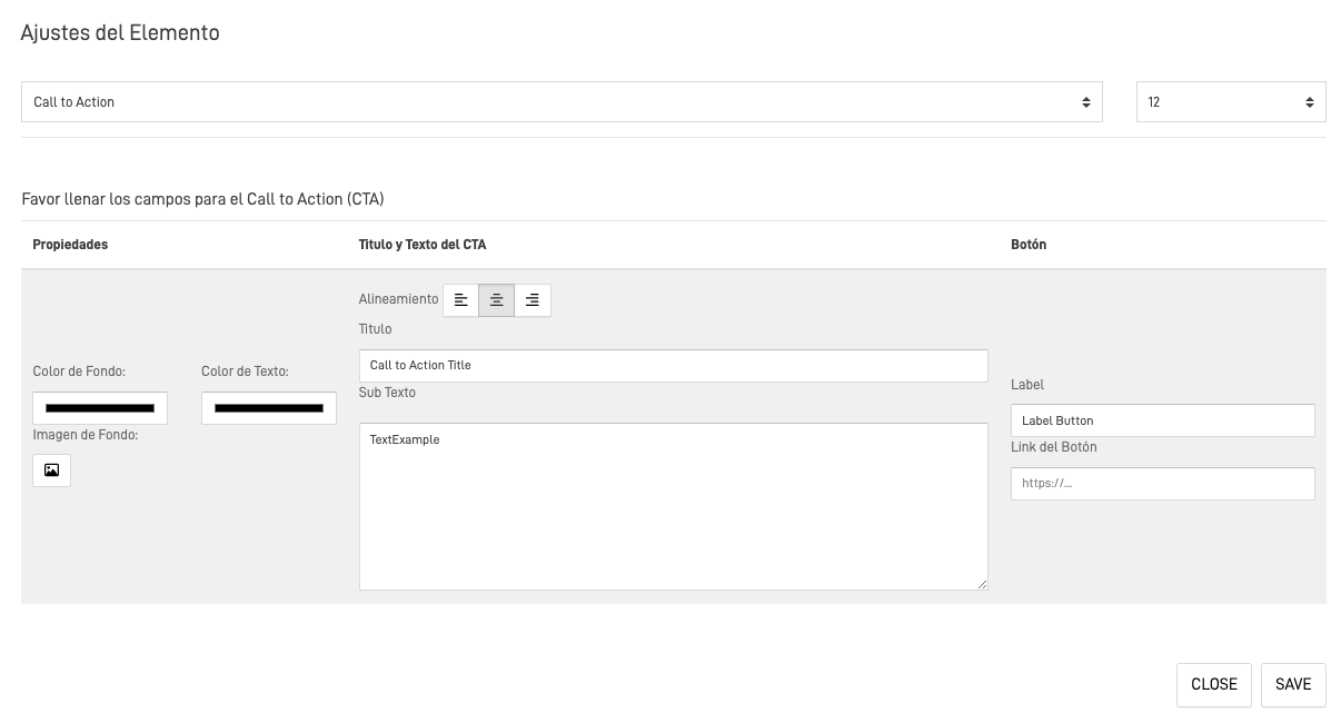
Call to action
A call to action is a prompt that tells the user to take some specified action. A call to action is typically written as a command or action phrase, such as 'Sign Up' or 'Buy Now' and generally takes the form of a button or hyperlink.
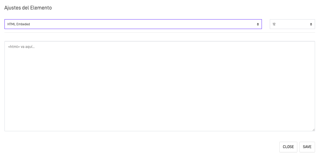
HTML Embeded
This Element let you add an Embeded HTML code to your form letting you customize the form page however you want.
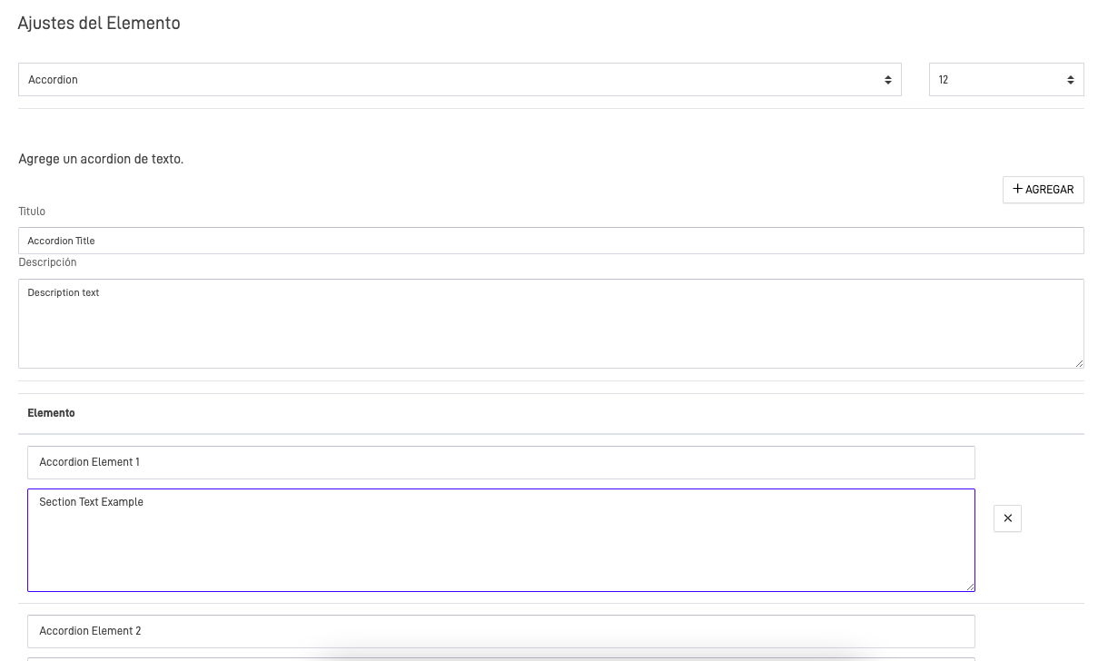
Accordion
This element allows you to add text in sections, formatted as an accordion. This means you can divide the text into sections where only the section titles are initially visible. Users can expand each section to view its corresponding text.
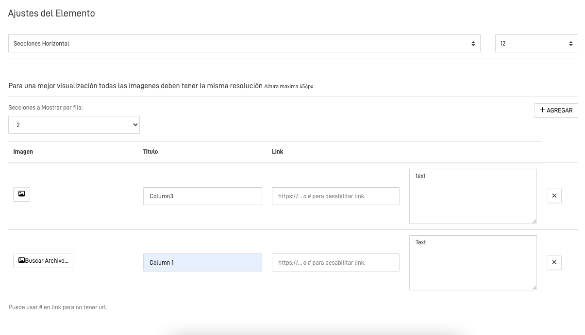
Horizontal Lines
This element allows you to create a horizontal line division to display multiple images or texts simultaneously. You can define how many elements to show per row.