
How to use the Calendar Screen?
Step-by-Step Guide: Calendar Screen
This guide provides detailed, sequential instructions for configuring a Calendar Screen in ARPIA. Follow these steps to transform your date-based data into an interactive calendar.
Before You Begin
What You'll Need:
- Repository name containing your events table
- Table name with your event data
- Knowledge Node (Main Kube) name that connects to your table
- Column names for: start date, end date, and event title
First time using Calendar Screen? Read the Calendar Screen Overview first to understand the concepts before configuring.
Step 1: Access the Screen Settings
The Calendar Screen has two control buttons in the top-right corner:
- Screen Settings (gear icon): Opens the configuration panel.
- Preview: Shows your calendar with current settings.
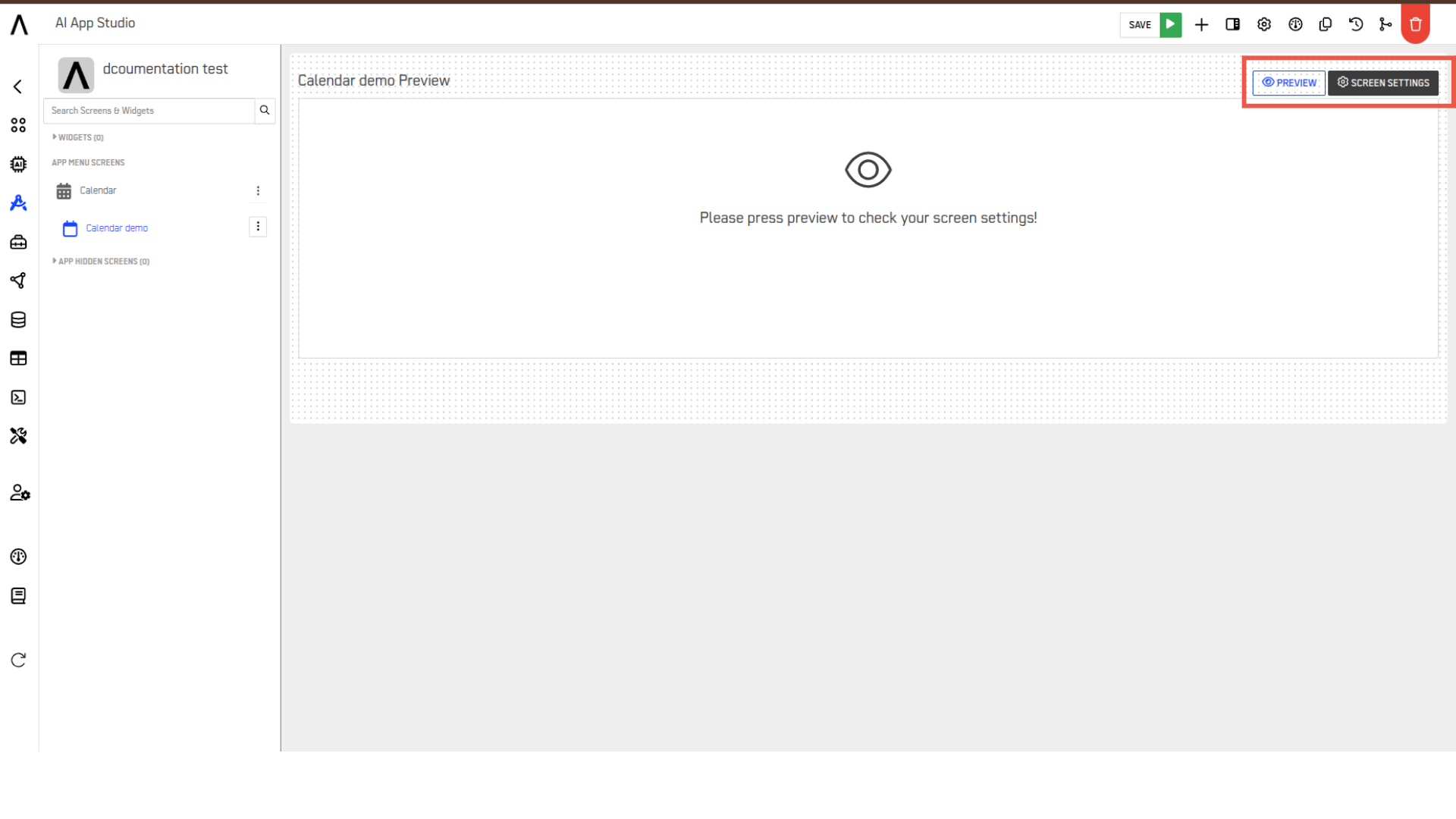
Click Screen Settings to open the configuration panel:
Understanding the Configuration Panel
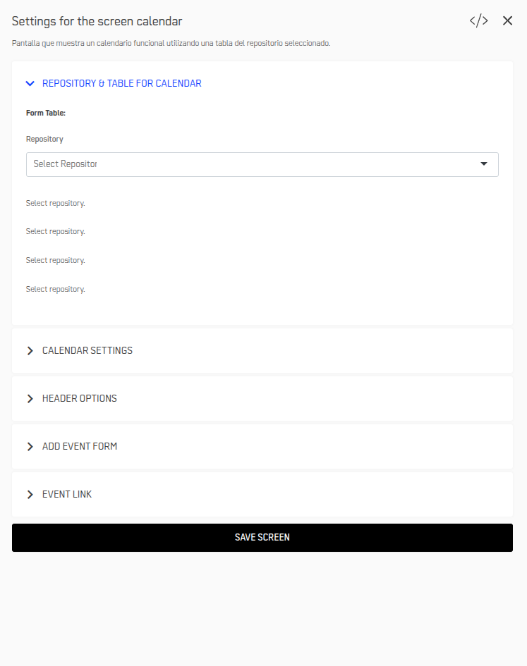
The settings panel contains 5 tabs:
| Tab | Description |
|---|---|
| Repository & Table for Calendar | Data source connection. |
| Calendar Settings | Display options and user capabilities |
| Header Options | Navigation buttons and actions |
| Add Event Form | Event creation/editing interface |
| Event Link | What happens when users click events |
Step 2: Select Repository, Table and Knowledge Node
First, configure the data source for your calendar events.
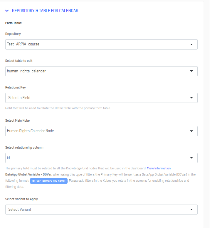
Configure Data Source
- Select your Repository from the dropdown
- Click SAVE in the top-right corner
- Refresh your browser page
Critical Step
You MUST refresh after selecting the repository. This allows ARPIA to load available tables and nodes.
Select Main Kube (Knowledge Node)
What is Main Kube?
The Main Kube (Knowledge Node) is a required data access layer that connects your calendar to the table. The calendar cannot access table data directly—it must go through a Knowledge Node.
Before proceeding: Ensure you have already created a Knowledge Node for your events table. If not, create one now:
- Go to Knowledge Nodes section in ARPIA
- Create a new node pointing to your events table
- Configure the node with necessary columns
- Save the node
Configure Main Kube:
- In the Select Main Kube dropdown, select your Knowledge Node
- Click SAVE
- Refresh your browser page
- Return to Screen Settings
Important: Without a Main Kube selected, your calendar will not be able to display any events.
Select Your Table
- In the Select table to edit dropdown, select your events table
- Click SAVE
- Refresh your browser page again
- Return to Screen Settings
Critical Step: You MUST refresh after selecting the table. This loads the specific columns you'll map in Step 3.
Optional: Configure Relational Key
What is Relation Key? Links your events table to a related detail table through the Knowledge Node. For example, linking an "Events" table to an "Event_Details" table.
When to use it:
- You have supplementary information in another table
- You need to display or edit related records
- You're building a complex event management system
When to skip it:
- All your event information is in one table
- You're building a simple calendar
- You're just getting started
If using Relational Key:
- Select the Relational Key dropdown
- Choose the column that links to your detail table
- In Select relationship column, choose the primary field
- Click SAVE
Step 3: Configure Calendar Settings
Click the Calendar Settings tab to configure how your calendar displays event data.
Configure Requiered Fields
These four fields are required for your calendar to work:
| Field | Description |
|---|---|
| Start Calendar in: | Choose default view: Month, Week, Day, or List. |
| Event Start Date Column: | Column with start date/time |
| Event End Date Column: | Column with end date/time |
| Event Title Column: | Column from your table that will be displayed as the event title on the calendar. |
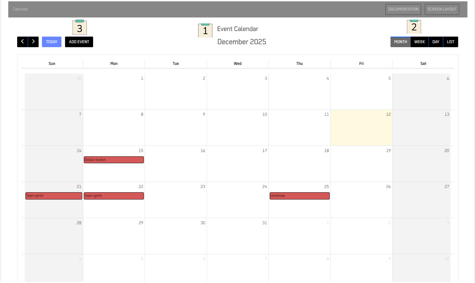
Click the Preview button (top-right corner).
You should now see your events on the calendar! If not, see Troubleshooting below.
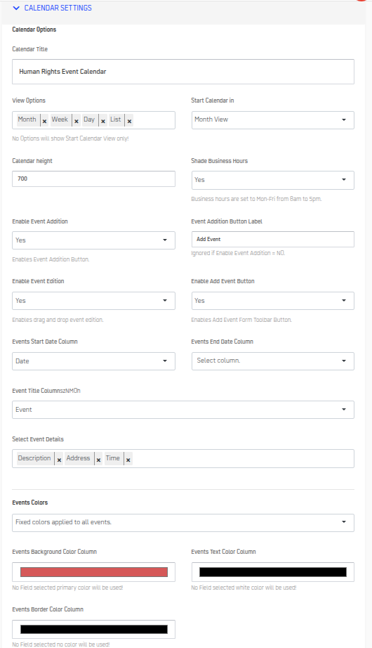
Configure Optional Display Settings
Display Options:
| Field | Description | Recommended Setting |
|---|---|---|
| Calendar Title (1) | Header text above calendar | Your app name or "Events Calendar" |
| View Options (2) | Let users switch views | Enable Month, Week, Day, List |
| Calendar Height | Display height in pixels | 950 (default) or 1000 for more space |
| Shade Business Hours | Highlight Mon-Fri 8 AM-5 PM | Enable for business schedules |
Interaction Options
| Field | Purpose | When to Enable |
|---|---|---|
| Enable Event Addition | Let users create events | When users need to add events |
| Event Addition Button Label(3) | Button Text | Change to "+ New Event" or "+ Add" |
| Enable Event Edition | Allow dra g-and-drop rescheduling | When users need to move events |
| Enable Add Event Button | Show add button in toolbar | Almost always (if addition enabled) |
Event Details Display
| Field | Purpose | Example |
|---|---|---|
| Select Event Details | Additional fields to show in popup | Choose fields like "venue", "coordinator", "status" |
Color Configuration
| Field | Purpose | Notes |
|---|---|---|
| Events Colors | Color scheme for events | Fixed colors or dynamic based on data |
| Events Background Color Column | Column to determine background color | Optional customization |
| Events Text Color Column | Column to determine text color | Optional customization |
| Events Border Color Column | Column to determine border color | Optional customization |
Example configuration:
Step 4: Configure Header Options
Customize the calendar header and add action buttons that navigate to other screens or external URLs.
Enable Header
- Find Show Header Options
- Select Yes
- The header section will appear above your calendar
Add Action Buttons
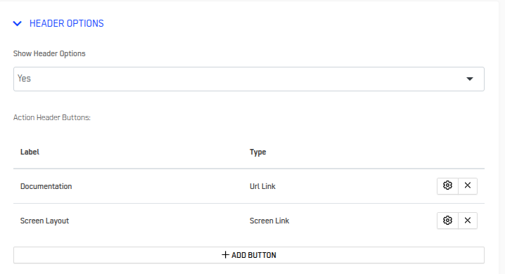
Click + ADD BUTTON to create a new button.
For Screen Link Buttons
- Label of Button : Enter button text (e.g., "View All Events")
- Button Type: Select "Screen Link"
- Select Screen: Choose destination screen from dropdown
- Click APPLY
For URL Link Buttons
- Label of Button: Enter button text (e.g., "Export Calendar")
- Button Type: Select "URL Link"
- URL to link: Enter full URL (e.g., https://yourcompany.com/export)
Manage Existing Buttons
All created buttons appear in the Action Header Buttons list.
For each button, you can:
- Edit: Click the gear icon → Modify settings → APPLY
- Delete: Click the X icon → Confirm deletion
Button Recommendations
Useful button combinations:
For Event Management
- "View All Events" (List Screen)
- "Reports" (Dashboard Screen)
- "Settings" (Configuration Screen)
For External Integration
- "Export to CSV" (URL to export function)
- "Help Guide" (URL to documentation)
Step 5: Design the Add Event Form
This is where you design the form that appears when users add or edit calendar events. The form builder uses fields from your Knowledge Node.
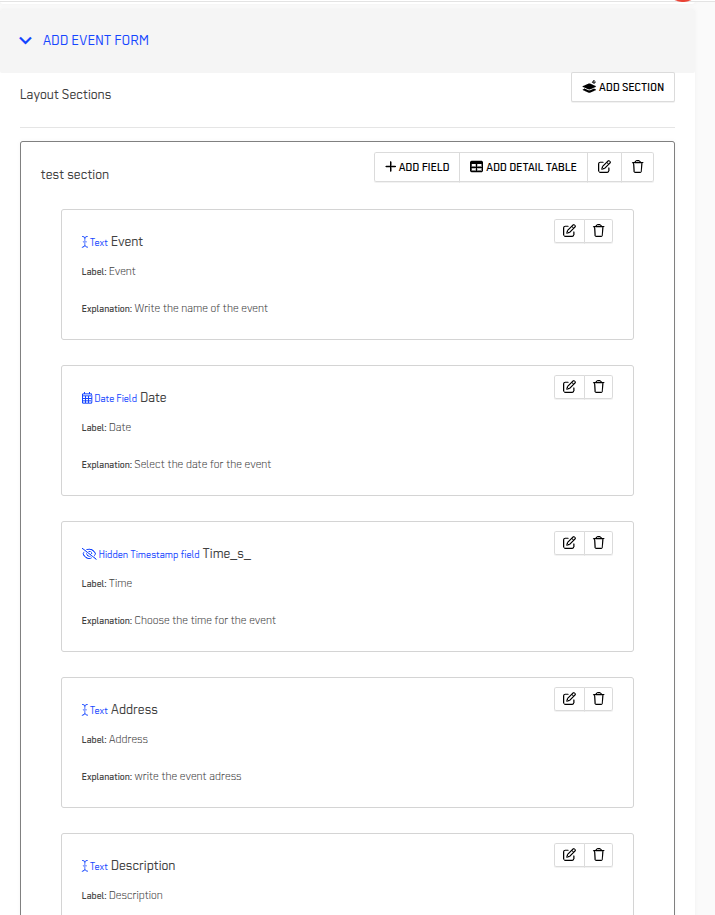
When you add a field, you'll configure these properties:
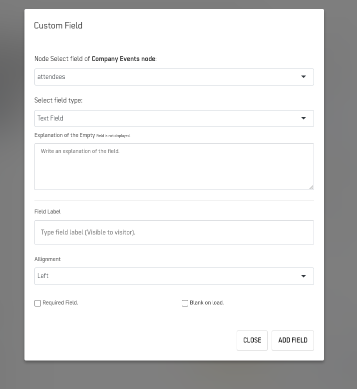
| Property | Purpose | Example |
|---|---|---|
| Node Select field | Choose which column from your Knowledge Node | event_name, start_datetime, venue |
| Select field type | Type of input control | Text Field, Date Time, Number, Dropdown, Text Area |
| Explanation of the Empty | Help text shown when field is empty | "Enter the event title" |
| Field Label | Label visible to users | "Event Name", "Start Date & Time" |
| Alignment | Field alignment | Left, Center, Right |
| Required Field | Whether field must be filled | Check for required fields |
| Blank on load | Whether field starts empty | Uncheck to show existing data |
Managing Fields
- Reorder: Drag fields up/down to change order
- Edit: Click gear icon on any field
- Delete: Click X icon to remove field
Essential Fields to Include
Minimum Required Fields:
- Event Title Field
- Node field: event_name
- Field type: Text Field
- Field Label: "Event Name"
- Required Field: ✓ Checked
- Start Date/Time Field
- Node field: start_datetime
- Field type: Date Time
- Field Label: "Start Date & Time"
- Required Field: ✓ Checked
- End Date/Time Field
- Node field: end_datetime
- Field type: Date Time
- Field Label: "End Date & Time"
- Required Field: ✓ Checked
Recommended Additional Fields:
- Event Type (dropdown or text)
- Venue/Location (text field)
- Description/Notes (text area)
- Status (dropdown or text)
- Coordinator (text field or dropdown)
Form Organization Best Practices
- Group Related Fields
- Use Clear Labels
- Add Helpful Empty Explanations
Note: For detailed information on form design capabilities, refer to the Form Layout documentation.
Step 6: Configure Event Click Behavior
Define what happens when a user clicks on a calendar event. Four options are available:
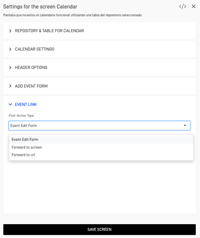
Option 1: Event Edit Form
Opens the edit form you designed in the "Add Event Form" settings tab. Users can modify event details directly.
When to use:
- Users frequently need to edit events
- Quick updates are the primary use case
- You don't have a separate detail screen
How to configure:
- Select Event Edit Form
- Click SAVE
Option 2: Forward to Screen
Navigates the user to a specified screen within the application.
When to use:
- You have a detail screen with comprehensive event information
- Users need to see related data (attendees, documents, history)
- You want to provide multiple actions (edit, delete, duplicate)
How to configure:
- Select Forward to Screen
- Primary Key Handling: Choose one:
- As a relationship: Establishes relational link
- Not sent: Just navigates without passing ID
- Select Screen: Choose destination screen from dropdown
- Click Save
Option 3: Open Screen in right sidebar
Shows the target screen in a sidebar panel while keeping the calendar visible
When to use:
- Users need to reference the calendar while viewing details
- You want to avoid full navigation away from calendar
- Quick reference is the primary need
How to configure:
- Select Open Screen in right sidebar
- Primary Key Handling: Choose one:
- As a relationship: Establishes relational link
- Not sent: Just navigates without passing ID
- Select Screen: Choose destination screen from dropdown
Option 4: Forward to URL
Redirects the user to an external URL.
When to use:
- You're integrating with an external system
- Event details live outside ARPIA
- You need to trigger external processes
How to configure:
- Select Forward to URL
- URL: Enter the full URL
- Click SAVE
Example: https://example.com/event-details?
Troubleshooting
Events Not Appearing
Problem: Calendar loads but no events show.
Solutions:
- Check date format: Must be YYYY-MM-DD HH:MM:SS format
- Verify column mapping: Screen Settings → Calendar Settings → Verify start/end date columns
- Verify date range: Navigate to the date range where your events should appear
- Check permissions: Verify user has read access to the table
Calendar Not Loading After Configuration
Problem: Blank screen or error message.
Solutions:
- Verify save and refresh: After selecting repository/table, did you save AND refresh browser?
- Verify table exists: Ensure the selected table hasn't been deleted or renamed
- Clear browser cache:
- Ctrl+Shift+Delete (Windows)
- Cmd+Shift+Delete (Mac)
- Clear cache and reload
- Check browser console for any error messages
Unable to Add or Edit Events
Problem: Buttons don't appear or don't work.
Solutions:
- Confirm that Enable Event Addition and Enable Event Edition are enabled
- Verify that you have appropriate permissions to modify the linked table
- Check form configuration:
- All required fields included in Add Event Form?
- All required fields marked as required?
- Form field validations not too restrictive?
Event Click Does Nothing
Problem: Clicking events has no effect.
Solutions:
- Check Event Link: Screen Settings → Event Link tab → Verify option selected
- Check destination:
- If "Forward to Screen": Does the screen exist and is it published?
- If "Forward to URL": Is the URL correct?
- Check primary key: Does your table have a primary key defined?
- Test alternative: Temporarily change Event Link to "Event Edit Form" to test basic functionality
Wrong Events Showing
Problem: Events appear on wrong dates or times.
Solutions:
- Check timezone: Dates might be storing in different timezone
Verify data:
sql   SELECT event_name, start_datetime, end_datetime
   FROM your_table
   WHERE start_datetime BETWEEN '2024-12-01' AND '2024-12-31';\`
- Check column mapping: Ensure start/end columns aren't swapped
Best Practices
✓ Start with required fields only - Add optional features after basic calendar works
✓ Use descriptive names for your Event Title Column to make events easily identifiable
✓ Use consistent date format - Always YYYY-MM-DD HH:MM:SS
✓ Keep primary key stable - Don't change event IDs after creation
✓ Enable Shade Business Hours for calendars used in business contexts
✓ Test event drag-and-drop functionality after enabling Enable Event Edition
✓ Keep the Add Event Form simple with only necessary fields to improve user experience
✓ Add helpful labels - "Event Budget (USD)" not just "Budget"
Related Documentation
Updated 7 months ago